I Think I Should Write a Quick Book…
In the end it’s about five and a half pounds of paper, 1280 pages, 973 illustrations and 583,313 words. And its creation took more than a decade of my life. Almost every day of my thirties, and a little beyond, I tenaciously worked on it. Figuring out more and more science. Developing new kinds of computational diagrams. Crafting an exposition that I wrote and rewrote to make as clear as possible. And painstakingly laying out page after page of what on May 14, 2002, would be published as A New Kind of Science.
I’ve written before (even in the book itself) about the intellectual journey involved in the creation of A New Kind of Science. But here I want to share some of the more practical “behind the scenes” journey of the making of what I and others usually now call simply “the NKS book”. Some of what I’ll talk about happened twenty years ago, some more like thirty years ago. And it’s been interesting to go back into my archives (and, yes, those backup tapes from 30 years ago were hard to read!) and relive some of what finally led to the delivery of the ideas and results of A New Kind of Science as truckloads of elegantly printed books with striking covers.
It was late 1989—soon after my 30th birthday—when I decided to embark on what would become A New Kind of Science. And at first my objective was quite modest: I just wanted to write a book to summarize the science I’d developed earlier in the 1980s. We’d released Version 1.0 of Mathematica (and what’s now the Wolfram Language) in June 1988, and to accompany that release I’d written what had rapidly become a very successful book. And while I’d basically built Mathematica to give me the opportunity to do more science, my thought in late 1989 was that before seriously embarking on that, I should spend perhaps a year and write a book about what I already knew, and perhaps tie up a few loose ends in the process.
My journey in science began in the early 1970s—and by the time I was 14 I’d already written three book-length “treatises” about physics (though these wouldn’t see the light of day for several more decades). I worked purely on physics for a number of years, but in 1979 this led me into my first big adventure in technology—thereby starting my (very productive) long-term personal pattern of alternating between science and technology (roughly five times so far). In the early 1980s—back in a “science phase”—I was fortunate enough to make what remains my all-time favorite science discovery: that in cellular automaton programs even with extremely simple rules it’s possible to generate immense complexity. And from this discovery I was led to a series of results that began to suggest what I started calling a general “science of complexity”.
By the mid-1980s I was quite well positioned in the academic world, and my first thought was to try to build up the study of the “science of complexity” as an academic field. I started a journal and a research center, and collected my papers in a book entitled Theory and Applications of Cellular Automata (later reissued as Cellular Automata and Complexity). But things developed slowly, and eventually I decided to go to “plan B”—and just try to create the tools and environment that I would need to personally push forward the science as efficiently as possible.
The result was that in late 1986 I started the development of Mathematica (and what’s now the Wolfram Language) and founded Wolfram Research. For several years I was completely consumed with the challenges of language design, software development and CEOing our rapidly growing company. But in August 1989 we had released Mathematica 1.2 (tying up the most obvious loose ends of Version 1.0)—and with the intensity of my other commitments at least temporarily reduced, I began to think about science again.
The Mathematica Book had been comparatively straightforward and fast for me to write—even as a “side project” to architecting and developing the system. And I imagined that it would be a somewhat similar experience writing a book explaining what I’d figured out about complexity.
My first working title was Complexity: An Introduction to the Science of Complex Phenomena. My first draft of a table of contents, from November 1989, begins with “A Gallery of Complex Systems” (or “The Phenomenon of Complexity”), and continues through nine other chapters, capturing some of what I then thought would be important (and in most cases had already studied):

I wrote a few pages of introductory text—beginning by stating the objective as:

My archives record that in late December I was taking a more computation-first approach, and considering the title Algorithms in Nature: An Introduction to Complexity. But soon I was submerged in the intense effort to develop Mathematica 2.0, and this is what consumed me for most of 1990—though my archives from the time reveal one solitary short note, apparently from the middle of the year:

But through all this I kept thinking about the book I intended to write, and wondering what it should really be like. In the late 1980s there’d been quite a run of unexpectedly successful “popular science” books—like A Brief History of Time—that mixed what were at least often claimed to be new results or new insights about science with a kind of intended-to-entertain “everyman narrative”. A sequence of publishers had encouraged me to “write a popular science book”. But should the book I was planning to write really be one of those?
I talked to quite a few authors and editors. But nobody could quite tell a coherent story. Perhaps the most promising insight came from an editor of several successful such books, who opined that he thought the main market for “popular science” books was people who in the past would have read philosophy books, but now those were too narrow and technical. Other people, though, told me they thought it was really more of an “internal market”, with the books basically being bought by other scientists. And in the media and elsewhere there continued to be an undercurrent of sentiment that while the books might be being bought, they mostly weren’t actually getting read.
“Isn’t there actual data on what’s going on?” I asked my publishing industry contacts. “No”, they said, “that’s just not how our industry works”. “Well”, I said, “why don’t we collect some data?” My then-publisher seemed enthusiastic about it. So I wrote a rather extensive survey to do on “random shoppers” in bookstores. It began with some basic—if “1990-style”—demographic questions, then got to things like

and rather charmingly ended with

(and, yes, in reality it took almost the longest time I could imagine for electronic books to become common). But after many months of “we’ll get results soon” it turned out almost no surveys were ever done. As I would learn repeatedly, most publishers seemed to have a very hard time doing anything they hadn’t already done before. Still, my then-publisher had done well with The Mathematica Book. So perhaps they might be able to just “follow a formula” and do well with my book if it was written in “popular science” form.
But I quickly realized that the pressure to add sensationalism “to sell books” really grated on me. And it didn’t take long to decide that, no, I wasn’t going to write a “formula” popular science book. I was going to write my own kind of book—that was more direct and straightforward. No stories. Just science. With lots of pictures. And if nothing else, the book would at least be helpful to me, as a way of clarifying my own thinking.
Beginning to Tool Up
In January 1991 we announced Mathematica 2.0—and in March and June I did a 35-city tour of the US and Europe talking about it. Then, finally, at the beginning of July we delivered final floppy disks to the duplicator (as one did in those days)—and Mathematica 2.0 was on its way. So what next? I had a long roadmap of things we should do. But I decided it was time to let the team I’d built just get on with following the roadmap for a while, without me adding yet more things to it. (As it turns out, we finally finished essentially everything that was on my 1991 to-do list just a few years ago.)
And so it was that in July 1991 I became a remote CEO (yes, a few decades ahead of the times), moved a couple thousand miles away from our company headquarters to a place in the hills near San Francisco, and set about getting ready to write. Based on the plan I had for the book—and my experience with The Mathematica Book—I figured it might take about a year, or maybe 18 months, to finish the project.
In the end—with a few trips in the middle, notably to see a total solar eclipse—it took me a couple of months to get my remote-CEO setup figured out (with a swank computer-connected fax machine, email getting autodelivered every 15 minutes, etc.). But even while that was going on, I was tooling up to get an efficient modern system for visualizing and studying cellular automata. Back when I had been writing my papers in the 1980s, I’d had a C program (primarily for Sun workstations) that had gradually grown, and was eventually controlled by a rather elaborate—but sensible-for-its-time—hierarchical textual menu system

which, yes, could generate at least single-graphic-per-screen graphics, as in this picture of my 1983 office setup:

But now the world had changed, and I had Mathematica. And I wanted a nice collection of Wolfram Language functions that could be used as streamlined “primitives” for studying cellular automata. Given all my work on cellular automata it might seem strange that I hadn’t built cellular automaton functionality into the Wolfram Language right from the start. But in addition to being a bit bashful about my personal pet kind of system, I hadn’t been able to see how to “package” all the various different kinds of cellular automata I’d studied into one convenient superfunction—and indeed it took me a decade more of understanding, both of language design and of cellular automata, to work out how to nicely do that. And so back in 1991 I just created a collection of add-on functions (or what might today be a paclet) containing the particular functions I needed. And indeed those functions served me well over the course of the development of A New Kind of Science.
A “staged” screen capture from the time shows my basic working environment:

Some printouts from early 1991 give a sense of my everyday experience:

And although it’s now more than 30 years later, I’m happy to say that we’ve successfully maintained the compatibility of the Wolfram Language, and those same functions still just run! The .ma format of my Version 2.0 notebooks from 1991 has to be converted to .nb, but then they just open in Version 13 (with a bit of automatic style modernization) and I’m immediately “transported back in time” to 1991, with, yes, a very small notebook appropriate for a 1991 rather than a 2022 screen size:

(Of course the cellular automata all look the same, but, yes, this notebook looks shockingly similar to ones from our recent cellular automaton NFT-minting event.)
We’d invented notebooks in 1987 to be able to do just the kinds of things I wanted to do for my science project—and I’d been itching to use them. But before 1991 I’d mostly been doing core code development (often in C), or using the elaborate but still textual system we had for authoring The Mathematica Book. And so—even though I’d demoed them many times—I hadn’t had a chance to personally make daily use of notebooks.
But in 1991, I went all in on notebooks—and have never looked back. When I first started studying cellular automata back in 1981, I’d had to display their output as text. But soon I was able to start using the bitmapped displays of workstation computers, and by 1984 I was routinely printing cellular automaton images in fairly high resolution on a laser printer. But with Mathematica and our notebook technology things got dramatically more convenient—and what had previously often involved laborious work with paper, scissors and tape now became a matter of simple Wolfram Language code in a notebook.
For almost a decade starting in 1982, my primary computer had been a progressively more sophisticated Sun workstation. But in 1991 I switched to NeXT—mainly to be able to use our notebook interface, which was by then well developed for NeXT but wasn’t yet ready on X Windows and Sun. (It was also available on Macintosh computers, but at the time those weren’t powerful enough.)
And here I am in 1991, captured “hiding out” as a remote CEO, with a NeXT in the background, just getting started on the book:

Here’s a picture showing a bit more of the setup, taken in early 1993, during a short period when I was a remote-remote-CEO, with my computer set up in a hotel room:

September 1991: Beyond Cellular Automata
Throughout the 1980s, I’d used cellular automata—and basically cellular automata alone—as my window into the computational universe. But in August 1991—with my new computational capabilities and new away-from-the-company-to-do-science setup—I decided it’d be worth trying to look at some other systems.
And I have to say that now, three decades later, I didn’t remember just how suddenly everything happened. But my filesystem records that in successive days at the beginning of September 1991 there I was investigating more and more kinds of systems (.ma’s were “Mathematica notebook” files; .mb’s were the “binary forks” of these files):

Mobile automata. Turing machines. Tag systems. Soon these would be joined by register machines, and more. The first examples of these systems tended to have quite simple behavior. But I quickly started searching to see whether these systems—like cellular automata—would be capable of complex behavior, as my 1991 notebooks record:

Often I would run programs overnight, or sometimes for many days. Later I would recruit many computers from around our company, and have them send me mail about their results:

But already in September 1991 I was starting to see that, yes, just like cellular automata, all these different kinds of systems, even when their underlying rules were simple, could exhibit highly complex behavior. I think I’d sort of implicitly assumed this would be true. But somehow actually seeing it began to elevate my view of just how general a “science of complexity” one might be able to make.
There were a few distractions in the fall of 1991. Like in October a large fire came within about half a mile of burning down our house:

But by the spring of 1992 it was beginning to become clear that there was a very general principle around all this complexity I was seeing. I had invented the concept of computational irreducibility back in 1984. And I suppose in retrospect I should have seen the bigger picture sooner. But as it was, on a pleasant afternoon (and, no, I haven’t figured out the exact date), I was taking a short break from being in front of my computer, and had wandered outside. And that’s when the Principle of Computational Equivalence came to me. Somehow after all those years with cellular automata, and all those months with computer experiments on other systems, I was primed for it. But in the end it all arrived in one moment: the concept, the name, the implications for computational irreducibility. And in the three decades since, it’s been the single most important guiding principle for my intuition.
What Should the Pages Look Like?
I’ve always found it difficult to produce “disembodied content”: right from the beginning I typically need to have a pretty clear idea how what I’m producing will look in the end. So back in 1991 I really couldn’t produce more than a page or two of content for my book without knowing what the book was going to look like.
“Formula” popular science books tended—for what I later realized were largely economic reasons—to consist mainly of pages of pure text, with at most line drawings, and to concentrate whatever things like photographs they might have into a special collection of “plates” in the middle of the book. For The Mathematica Book we’d developed a definite—very functional—layout, with text, tables and two-column “computer dialogs”:

For the NKS book I knew I needed something much more visual. And at first I imagined it might be a bit like a high-end textbook, complete with all sorts of structured elements (“Historical Note”, “Methodology”, etc.).
I asked a talented young designer who had worked on The Mathematica Book (and who, 31 years later, is now a very senior executive at our company) to see what he could come up with. And here, from November 1991, is the very first “look” for the NKS book—with content pretty much just flowed in from the few pages I’d written out in plain text:

I knew the book would have images of the kind I’d long produced of cellular automata, and that had appeared in my papers and book from the 1980s:

But what about “diagrams”? At first we toyed with drawing “textbook-style” diagrams—and produced some samples:

But these seemed to have way too much “conceptual baggage”, and when one looks closely at them, it’s easy to get confused. I wanted something more minimal—where the spotlight was as much as possible on the systems I was studying, not on “diagrammatic scaffolding”. And so I tried to develop a “direct diagramming” methodology, where each diagram could directly “explain itself”—and where every diagram would be readable “purely visually”, without words.
In a typical case I might show the behavior of a system (here a mobile automaton), next to an explicit “visual template” of how its rules operate. The idea then was that even a reader who didn’t understand the bigger story, or any of the technical details, could still “match up templates” and understand what was going on in a particular picture:

At the beginning of the project, the diagrams were comparatively simple. But as the project progressed I invented more and more mechanisms for them, until later in the project I was producing very complex “visually readable” diagrams like this:

A crucial point was that all these diagrams were being produced algorithmically—with Wolfram Language code. And in fact I was developing the diagrams as an integral part of actually doing the research for the book. It was a lesson I’d learned years earlier: don’t wait until research is “finished” to figure out how to present it; work out the presentation as early as possible, so you can use it to help you actually do the research.
Another aspect of our first “textbook-like” style for the book was the idea of having additional elements, alongside the “main narrative” of the book. In early layouts we thought about having “Technical Notes”, “Historical Notes”, “Implementation Notes”, etc. But it didn’t take too long to decide that no, that was just going to be too complicated. So we made the decision to have one kind of note, and to collect all notes at the back of the book.
And that meant that in the main part of the book we had just two basic elements: text and images (with captions). But, OK, in designing any book a very basic question is: what size and shape will its pages be? The Mathematica Book was squarish—like a typical textbook—so that it accommodated its text-on-the-left code-on-the-right “dialogs”. We knew that the new book should be wide too, to accommodate the kinds of graphics I expected. But that posed a problem.
In The Mathematica Book ordinary text ran the full width of the page. And that worked OK, because in that book the text was typically broken up by dialogs, tables, etc. In the new book, however, I expected much longer blocks of pure text—which wouldn’t be readable if they ran the full width of the page. But if the text was narrower, then how would the graphics not look like they were awkwardly sticking out? Well, the pages would have to be carefully laid out to appropriately anchor the graphics visually, say to the tops or bottoms of pages. And that was going to make the process of layout much trickier.
Different pages were definitely going to look different. But there had to be a certain overall consistency. Every graphic was going to have a caption—and actually a caption that was sufficiently self-contained so that people could basically “read the book just by looking at the pictures”. Within the graphics themselves there had to be standards. How should arrays of cells be rendered? To what extent should things have boxes around them, or arrows between them? How big should pictures that emphasized particular features be?
Some of these standards got implemented basically just by me remembering to follow them. But others were essentially the result of the whole stack of Wolfram Language functions that we built to produce the algorithmic diagrams for the book. At the time, there was some fiddliness to these functions, and to making their output look good—though in later years what we learned from this was used to tune up the general look of built-in graphics in the Wolfram Language.
The Technology of Images
One of the striking features of the NKS book is the crispness of its pictures. And I think it’s fair to say that this wasn’t easy to achieve—and in the end required a pretty deep dive into the technology of imaging and printing (as I’ll describe more in a later section).
Back in the 1980s I’d had plenty of pictures of things like cellular automata in my papers. And I’d produced them by outputting what amounted to pages of bitmaps on laser printers, then having publishers photographically reproduce the pictures for printing.
Up to a point the results were OK:

But for example in 1985 when I wanted a 2000-step picture of rule 30 things got difficult. The computation (which, yes, involves 8 million cells) was done on a prototype Connection Machine parallel computer. And at first the output was generated on a large-format printer that was usually used to print integrated circuit layouts. The result was quite large, and I subsequently laminated pictures like this (and in rolled-up form they served as engaging hiding places for my children when they were very young):

But when photographically reproduced and printed in a journal the picture definitely wasn’t great:

And the NKS book provided another challenge as well. While the core of a picture might just be an array of cells like in a cellular automaton, a full algorithmic diagram could contain all sorts of other elements.
In the end, the NKS book was a beneficiary of an important design decision that we made back in 1987, early in the development of Mathematica. At the time, most graphics were thought about in terms of bitmaps. On whatever device one was using, there was an array of pixels of a certain resolution. And the focus was on rendering the graphics at that resolution. Not everything worked that way, though. And “drawing” (as opposed to “painting”) programs typically created graphics in “vector” form, in which at first primitives like lines and polygons were specified without reference to resolution, and were then converted to bitmaps only when they were displayed.
The shapes of characters in fonts were something that was often specified—at least at an underlying level—in vector form. There’d been various approaches to doing this, but by 1987 PostScript was an emerging standard—at least for printing—buoyed by its use in the Apple LaserWriter. The main focus of PostScript was on fonts and text, but the PostScript language also included standard graphics primitives like lines and polygons.
Back when I had built SMP in 1979–1981 we’d basically had to build a separate driver for every different display or printing device we wanted to output graphics on. But in 1987 there was an alternative: just use PostScript for everything. Printer manufacturers were working hard to support PostScript on their printers, but PostScript mostly hadn’t come to screens yet. There was an important exception though: the NeXT computer was set up to have PostScript as its native screen-rendering system. And partly through that, we decided to use PostScript as our underlying way to represent all graphics in Mathematica.
At a high level, graphics were described with the same symbolic primitives as we use in the Wolfram Language today: Line, Polygon, etc. But these were converted internally to PostScript—and even stored in notebooks that way. On the NeXT this was pretty much the end of the story, but on other systems we had to write our own interpreters for at least the subset of PostScript we were using.
Why was this important to the NKS book? Well, it meant that all graphics could be specified in a fundamentally resolution-independent way. In developing the graphics I could look at them in a notebook on a screen, or I could print them on a standard laser printer. But for the final book the exact same graphics could be printed at much higher resolution—and look much crisper.
At the time, the standard resolution of a computer screen was 72 dpi (dots per inch) and the resolution of a typical laser printer was 300 dpi. But the typical basic resolution of a book-printing pipeline was more like 2400 dpi. I’ll talk later about the adventure of actually printing the NKS book. But the key point was that because Mathematica’s graphics were fundamentally based on PostScript, they weren’t tied to any particular resolution, so they could in principle make use of whatever resolution was available.
Needless to say, there were plenty of complicated issues. One had to do with indicating the cells in something like a cellular automaton. Here’s a picture of the first few steps of rule 30, shown as a kind of “macro bitmap”, with pure black and white cells:

✕
|
But often I wanted to indicate the extent of each cell:

✕
|
And in late 1991 and early 1992 we worried a lot about how to draw the “mesh” between cells. A first thought was just to use a thin black line. But that obviously wouldn’t work, because it wouldn’t separate black cells. And we soon settled on a GrayLevel[.15] line, which was visible against both black and white.
But how is such a line printed? If we’re just using black ink, there’s ultimately either black or white at a particular place on the page. But there’s a standard way to achieve the appearance of gray, by changing the local density of black and white. And the typical method used to implement this is (as we’ll discuss later) halftoning, in which one renders the “gray” by using black dots of different sizes.
But by the time one’s using very thin gray lines, things are getting very tricky. For example, it matters how much the ink on either side of the line spreads—because if it’s too much it can effectively fill in where the line was supposed to be. We wanted to define standards that we could use throughout the NKS book. And we couldn’t tell what would happen in the final printed book except by actually trying it, on a real printing press. So already in early 1992 we started doing print tests, trying out different thicknesses of lines and so on. And that allowed us to start setting graphics standards that we could implement in the Wolfram Language code used to make the algorithmic diagrams, that would then flow through to all renderings of those diagrams.
Back in 1991 we debated quite a bit whether the NKS book should use color. We knew it would be significantly more expensive to print the book in color. But would color allow seriously better communication of information? Two-color cellular automata like rule 30 can be rendered in pure black and white. But over the years I’d certainly made many striking color pictures of cellular automata with more colors.
Somehow, though, those pictures hadn’t seemed quite as crisp as the black and white ones. And there was another issue too, having to do with a problem I’d noticed in the mid-1980s in human visual perception of arrays of colored cells. Somewhat nerdily, I ended up including a note about this in the final NKS book:

But the final conclusion was that, yes, the NKS book would be pure black and white. Nowadays—particularly with screen rendering being in many ways more important than print—it’s much easier to do things in color. And, for example, in our Physics Project it’s been very convenient to distinguish types of graphs, or nodes in graphs, by color. But for the NKS book I think it was absolutely the right decision to use black and white. Color might have added some nice accents to certain kinds of diagrams. But the clarity—and visual force—of the images in the book was much better served by the perceptual crispness of pure black and white.
How to Lay Out the Book
The way most books with complex formats get produced is that first the author creates “disembodied” pieces of content, then a designer or production artist comes in and arranges them on pages. But for the NKS book I wanted something where the process of creation and layout was much more integrated, and where—just as I was directly writing Wolfram Language code to produce images—I could also directly lay out final book pages.
By 1990 “desktop publishing” was commonplace, and there were plenty of systems that basically allowed one to put anything anywhere on a page. But to make a whole book we knew we needed a more consistent and templated approach—that could also interact programmatically with the Wolfram Language. There were a few well-developed “full-scale book production systems” that existed, but they were complex “industrially oriented” pieces of software, that didn’t seem realistic for me to use interactively while writing the book.
In mid-1990, though, we saw a demo of something new, running on the NeXT computer: a system called FrameMaker, which featured book-production capabilities, as well as a somewhat streamlined interchange format. Oh, and especially on the NeXT, it handled PostScript graphics well, inserting them “by reference” into documents. By late 1990 we were building book layout templates in FrameMaker, and we soon settled on using that for the basic production of the book. (Later, to achieve all the effects we wanted, we ended up having to process everything through Wolfram Language, but that’s another story.
We iterated for a while on the book design, but by the end of 1991 we’d nailed it down, and I started authoring the book. I made images using Mathematica, importing them in “Encapsulated PostScript” into FrameMaker. And words I typed directly into FrameMaker—in the environment reconstructed here using a virtual machine that we saved from the time of authoring the book:

I composed every page—not only its content, but also its visual appearance. If I had a cellular automaton to render, and it was going to occupy a certain region on a page, I would pick the number of cells and steps to be appropriate for that region. I was constantly adjusting pictures to make them look good on a given page, or on pairs of facing pages, or along with other nearby pictures, and so on.
One of the tricky issues was how to refer to pictures from within the text. In technical books, it’s common to number “figures”, so that the text might say “See Figure 16”. But I wanted to avoid that piece of “scaffolding”, and instead always just be able to say things like “the picture below”, or “the picture on the facing page“. It was often quite a puzzle to see how to do this. If a picture was too big, or the text was too small, the picture would get too far ahead, and so on. And I was constantly adjusting things to make everything work.
I also decided that for elegance I wanted to avoid ever having to hyphenate words in the text. And quite often I found myself either rewording things, or slightly changing letter spacing, to make things fit, and to avoid things like “orphaned” words at the beginnings of lines.
It was a strange and painstaking process getting each page to look right, and adjusting content and layout together. Sometimes things got a little pathological. I always wanted to fill out pages, and not to leave space at the bottom (oh, and facing pages had to be exactly the same height). And I also tried to start new sections on a new page. But there I was, writing Chapter 5, and trying to end the section on “Substitution Systems and Fractals”—and I had an empty bottom third of a page. What was I to do? I decided to invent a whole new kind of system, that appears on page 192, just to fill out the layout for page 191:

Looking through my archives, I find traces of other examples. Here are notes on a printout of Chapter 6. And, yes, on page 228 I did insert images of additional rules:

The Book Takes Shape
By the end of 1991 I was all set up to author and lay out the book. I started writing—and things went quickly. The first printout I have from that time is from May 1992, and it already has nearly 90 pages of content, with many recognizable pictures from the final NKS book:

✕
|
At that point the book was titled Computation and the Complexity of Nature, and the chapter titles were a bit different, and rather complexity themed:

✕
|
A large fraction of the main-text material about cellular automata was already there, as well as material about substitution systems and mobile automata. And there were extensive notes at the end, though at that point they were still single-column, and looked pretty much just like a slightly compressed version of the main text. And, by the way, Turing machines were just then appearing in the book, but still relegated to the notes, on the grounds that they “weren’t as minimal as mobile automata”.

✕
|
And hanging out, so far just as a stub, was the Principle of Computational Equivalence:

✕
|
By August 1992 the book had changed its title to A New Science of Complexity (subtitle: Rethinking the Mechanisms of Nature). There was a new first chapter “Some Fundamental Phenomena” that began with photographs of various “systems from nature”:

✕
|
Chapter 3 had now become “The Behavior of Simple Systems”. Turing machines were there. There was at least a stub for register machines and arithmetic systems. But even though I’d investigated tag systems in September 1991 they weren’t yet in the book. Systems based on numbers were starting to be there.
And then, making their first appearance (with the page tagged as having been modified May 25, 1992), were the multiway systems that are now so central to the multicomputational paradigm (or, as I had originally and perhaps more correctly called them in this case, “Multiway Substitution Systems”):

✕
|
By September 1992, register machines were in, complete with the simplest register machine with complex behavior (that had taken a lot of computer time to find). My simple PDE with complex behavior was also there. By early 1993 I had changed its name again, to A Science of Complexity, and had begun to have a quite recognizable chapter structure (though not yet with realistic page numbers):

✕
|
It imagined a rather different configuration of notes than eventually emerged:

✕
|
Making its first appearance was a chapter on physics, though still definitely as a stub:

✕
|
This version of the book opened with “chapter summaries”, noting about the chapter on fundamental physics that “[Its] high point is probably my (still speculative) attempt to reformulate the foundation of physics in computational terms, including new models for space, time and quantum mechanics”:

✕
|
By February 1994 I was getting bound mockups of the book made, with the final page size, though the wrong title and cover, and at that point only 458 pages (rather than the eventual 1280):

✕
|
The two-column format for the notes at the back was established, and even though the content of notes for the still-complexity-themed first chapter were rather different from the way they ended up, some later notes already looked pretty much the same as they would in the final book:

✕
|
By September 1994 the draft of the book was up to 658 pages. The chapter structure was almost exactly as it finally ended up, albeit also with an epilog, and a bibliography (more about these later):

✕
|
The September 1994 draft contained a section entitled “The Story of My Work on Complexity” (later renamed to the final “The Personal Story of the Science in this Book”) which then included an image of what a Wolfram Notebook on NeXT looked like at the time:

✕
|
The caption talked about how in the course of the project I’d generated 3 gigabytes of notebooks—a number which would increase considerably before the book was finished. Charmingly, the caption also said: “The card at the back of this book gives information about obtaining some of the programs used”. Our first corporate website went live on October 7, 1994.
By late 1994 the form of the book was basically all set. I’d successfully captured pretty much everything I’d known when I started on the book back in 1991, and I’d had three years of good discoveries. But what was still to come was seven years of intense research and writing that would take me much further than I had ever imagined back in 1991—and would end up roughly doubling the length of the book.
Photographs for the Book
In 1991 I knew the book I was going to write would have lots of cellular automaton pictures. And I imagined that the main other type of pictures it would contain would be photographs of actual, natural systems. But where was I going to get those photographs from? There was no web with image search back then. We looked at stock photo catalogs, but somehow the kinds of images they had (often oriented towards advertising) were pretty far from what we wanted.
Over the years, I had collected—albeit a bit haphazardly—quite a few relevant images. But we needed many more. I wanted pictures illustrating both complexity, and simplicity. But the good news was that, as I explained early in the book, both are ubiquitous. So it should be easy to find examples of them—that one could go out and take nice, consistent photographs of.
And starting in late 1991, that’s just what we did. My archives contain all sorts of negatives and contact prints (yes, this was before digital photography, and, yes, that’s a bolt—intended as an example of simplicity in an artifact):

✕
|
Sometimes the specimens I’d want could easily be found in my backyard

✕
|
or in the sky

✕
|
or on my desk (and even after waiting 400 million years, the trilobite fossil didn’t make it in)

✕
|
Over the course of a couple of years, I’d end up visiting all sorts of zoos, museums, labs, aquariums and botanical gardens—as well as taking trips to hardware stores and grocery stores—in search of interesting forms to photograph for the book.
Sometimes it would be a bit challenging to capture things in the field (yes, that’s a big leaf I’m holding on the right):

✕
|
At the zoo, a giraffe took a maddeningly long time to turn around and show me the other side of its patterning (I was very curious how similar they were):

✕
|
There were efforts to get pictures of “simple forms” (yes, that’s an egg)

✕
|
with, I now notice, a cameo from me—captured in mid experiment:

✕
|
Sometimes the subjects of photographs—with simple or complex forms—were acquired at local grocery stores (did I eat that cookie?):

✕
|
I cast about far and wide for forms to photograph—including, I now realize, all of rock, paper and scissors, each illustrating something different:

✕
|
Sometimes we tried to do actual, physical experiments, here with billiard balls (though in this case looking just like a simulation):

✕
|
and here with splashes:

✕
|

✕
|
I was very interested in trying to illustrate reproducible apparently random behavior. I got a several-feet-tall piece of glassware at a surplus store and repeatedly tried dropping dye into water:

✕
|
I tried looking at smoke rising:

✕
|
These were all do-it-yourself experiments. But that wasn’t always enough. Here’s a visit to a fluid dynamics lab (yes, with me visible checking out the hydraulic jump):

✕
|
I’d simulated flow past an obstacle, but here it was “visualized” in real life:

Then there was the section on fracture. Again, I wanted to understand reproducibility. I got a pure silicon wafer from a physicist friend, then broke it:

✕
|
Under a powerful microscope, all sorts of interesting structure was visible on the fracture surface—that was useful for model building, even if not obviously reproducible:

✕
|
And, talking of fractures, in March 1994 I managed to slip on some ice and break my ankle. Had I had pictures of fractures in the book, I was thinking of including an x-ray of my broken bones:

✕
|
There are all sorts of stories about photographs that were taken for the book. In illustrating phyllotaxis (ultimately for Chapter 8), I wanted cabbage and broccoli. They were duly obtained from a grocery store, photographed, then eaten by the photographer (who reported that the immortalized cabbage was particularly tasty):

✕
|
Another thing I studied in the book was shapes of leaves. Back in 1992 I’d picked up some neighborhood leaves where I was living in California at the time, then done a field trip to a nearby botanical garden. A couple of years later—believing the completion of the book was imminent—I was urgently trying to fill out more entries in a big array of leaf pictures. But I was in the Chicago area, and it was the middle of the winter, with no local leaves to be found. What was I to do? I contacted an employee of ours in Australia. Conveniently it turned out he lived just down the street from the Melbourne botanical gardens. And there he found all sorts of interesting leaves—making my final page a curious mixture of Californian and Australian fauna:

✕
|
As it turned out, by the next spring I hadn’t yet finished the book, and in fact I was still trying to fill in some of what I wanted to say about leaves. I had a model for leaf growth, but I wanted to validate it by seeing how leaves actually grow. That turned out not to be so easy—though I did dissect many leaf buds in the process. (And it was very convenient that this was a plant-related question, because I’m horribly squeamish when it comes to dissecting animals, even for food.)
Some of what I wanted to photograph was out in the world. But some was also collectible. Ever since I was a kid I had been gradually acquiring interesting shells, fossils, rocks and so on, sometimes “out in the field”, but more often at shops. Working on the NKS book I dramatically accelerated that process. Shells were a particular focus, and I soon got to the point where I had specimens of most of the general kinds with “interesting forms”. But there were still plenty of adventures—like finding my very best sample of “cellular-automaton-like” patterning, on a false melon volute shell tucked away at the back of a store in Florida:

✕
|
In 1998 I was working on the section of the book about biological growth, and wanted to understand the space of shell shapes. I was living in the Chicago area at that time, and spent a lovely afternoon with the curator of molluscs at the Field Museum of Natural History—gradually trying to fill in (with a story for every mollusc!) what became the array on page 416 of the book:

✕
|
And actually it turned out that my own shell collection (with one exception, later remedied) already contained all the necessary species—and in a drawer in my office I still have the particular shells that were immortalized on that page:

✕
|
I started to do the same kind of shape analysis for leaves—but never finished it, and it remains an open project even now:

✕
|
My original conception had been to start the book with “things we see in nature and elsewhere” and then work towards models and ideas of computation. But when I switched to “computation first” I briefly considered going to more “abstracted photographs”, for example by stippling:

✕
|
But in the end I decided that—just like my images of computational systems—any photographs should be as “direct as possible”. And they wouldn’t be at the beginning of the book, but instead would be concentrated in a specific later chapter (Chapter 8: “Implications for Everyday Systems”). Pictures of things like bolts and scissors became irrelevant, but by then I’d accumulated quite a library of images to choose from:

✕
|
Many of these images did get used, but there were some nice collections, that never made it into the book because I decided to cut the sections that would discuss them. There were the “things that look similar” arrays:

✕
|
And there were things like pollen grains or mineral-related forms (and, yes, I personally crystallized that bismuth, which did at least make it into the notes):

✕
|

✕
|
There were all sorts of unexpected challenges. I wanted an array of pictures of animals, to illustrate their range of pigmentation patterns. But so many of the pictures we could find (including ones I’d taken myself) we couldn’t use—because I considered the facial expressions of the animals just too distracting.
And then there were stories like the “wild goose chase”. I was sure I’d seen a picture of migrating birds (perhaps geese) in a nested, Sierpiński-like pattern. But try as we might, we couldn’t find any trace of this.
But finally I began to assemble pictures into the arrays we were going to use. In the end, only a tiny fraction of the “nature” pictures we had made it into the book (and, for example, neither the egg nor the phyllotactically scaled pangolin here did)—some because they didn’t seem clear in what they were illustrating, and some because they just didn’t fit in with the final narrative:

✕
|
Beyond the natural world, the more I explored simple programs and what they can do, the more I wondered why so many of the remarkable things I was discovering hadn’t been discovered before. And as part of that, I was curious what kinds of patterns people had in fact constructed from rules, for art or otherwise. On a few occasions during the time I was working on the book, I managed to visit relevant museums, searching for unexpected patterns made by rules:

✕
|

✕
|
But mostly all I could do was scour books on art history (and architecture) looking for relevant pictures (and, yes, it was books at the time—and in fact the web didn’t immediately help even when it became available). Sometimes I would find a clear picture, and we would just ask for permission to reproduce it. But often I was interested in something that was for example off on the side in all the pictures we could find. So that meant we had to get our own pictures, and occasionally that was something of an adventure. Like when we got an employee of ours who happened to be vacationing in Italy to go to part of an obscure church in rural Italy—and get a photograph of a mosaic there from 1226 AD (and, yes, those are our photographer’s feet):

✕
|
What Should the Book Be Called?
When I started working on the book in 1991 I saw it as an extension of what I’d done in the 1980s to establish a “science of complexity”. So at first I simply called the book The Science of Complexity, adding the explanatory subtitle A Unified Approach to Complex Behavior in Natural and Artificial Systems. But after a while I began to feel that this sounded a bit stodgy—and like a textbook—so to spruce it up a bit I changed it to A New Science of Complexity, with subtitle Rethinking the Mechanisms of Nature:

✕
|
Pretty soon, though, I dropped the “New” as superfluous, and the title became A Science of Complexity. I always knew computation was a key part of the story, but as I began to understand more about just what was out there in the computational universe, I started thinking I should capture “computation” in the name of the book, leading to a new idea: Computation and the Complexity of Nature. And for this title I even had a first cover draft made—complete with an eye, added on the theory that human visual perception would draw people to the eye, and thus make them notice the book:

✕
|
But back in 1992 (and I think it would be different today) people really didn’t understand the term “computation”, and it just made the book sound very technical to them. So back I went to A Science of Complexity. I wasn’t very happy with it, though, and I kept on thinking about alternatives. In August 1992 I prepared a little survey:

✕
|
The results of this survey were—like those of many surveys—inconclusive, and didn’t change my mind about the title. Still, in October 1992 I dashed off an email considering The Inevitable Complexity of Nature and Computation. But 15 minutes later, as I put it, I’d “lost interest” in that, and it was back to A Science of Complexity.
By 1993, believing that the completion of the book was somehow imminent, we’d started trying to mock up the complete look of the book, including things like the back cover, and cover flaps:

✕
|
The flap copy began: “This book is about a new kind of science that…”. In the first chapter there was then a section called “The Need for a New Kind of Science”:

✕
|
As 1993 turned into 1994 I was still working with great intensity on the book, leaving almost no time to be out and about, talking about what I was doing. Occasionally, though, I would run into people and they would ask me what I was working on, and I would say it was a book, titled A Science of Complexity. And when I said that—at least among non-technical people—the reaction was essentially always the same “Oh, that sounds very complicated”. And that would be the end of the conversation.
By September 1994 this had happened just too many times, and I realized I needed a new title. So I thought to myself “How would I describe the book?”. And there it was, right in the flap copy: “a new kind of science”. I made a quick note on the back of my then business card:

✕
|
And soon that was the title: A New Kind of Science. I started trying it out. The reaction was again almost always the same. But now it was “So, what’s new about it?” And that would start a conversation.
I liked the title a lot. It definitely said what by then I thought the book was about. But there was one thing I didn’t like. It seemed a bit like a “meta title”. OK, so you have a new kind of science. But what is that new kind of science called? What is its name? And why isn’t the book called that?
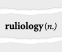
I spent countless hours thinking about this. I thought about word roots. I considered comp- (for “computation”), prog- (for “program”), auto- (for “automata”, etc.). I went through Latin and Greek dictionaries, and considered roots like arch- and log- (both way too confusing). I wrote programs to generate “synthetic words” that might evoke the right meaning. I considered names like “algonomics”, “gramistry”, “regulistics” (but not “ruliology”!), and “programistics”—for which I tried to see how its usage might work:

✕
|
But nothing quite clicked. And in a sense my working title already told me why: I was talking about “a new kind of science”, which involved a new way of thinking, for which there were really no words, because it hadn’t been done before.
I’d had a certain amount of experience inventing words, for concepts in both science and technology. Sometimes it had gone well, sometimes not so well. And I knew the same was true in general in history. For every “physics” or “economics” or even “cybernetics” there were countless names that had never made it.
And eventually I decided that even if I could come up with a name, it wasn’t worth the risk. Maybe a name would eventually emerge, and it would be perfectly OK if the “launch book” was called A New Kind of Science (as yet unnamed). Certainly much better than if it gave the new kind of science a definite name, but the name that stuck was different.
During the writing of A New Kind of Science, I didn’t really need to “refer in the third person” to what the book was about. But pretty much as soon as the book was published, there needed to be a name for the intellectual endeavor that the book was about. During the development of the book, some of the people working on its project management had started calling the book by the initials of its title: ANKOS. And that was the seed for the name of its content, which almost immediately became “NKS”.
Over the years, I’ve returned quite a few times to the question of naming. And very recently I’ve started using the term “ruliology” for one of the key pursuits of NKS: exploring the details of what systems based on simple computational rules do. I like the name, and I think it captures well the ethos of the specific scientific activity around studying the consequences of simple rules. But it’s not the whole story of “NKS”. A New Kind of Science is, as its name suggests, about a new kind of science—and a new way of thinking about the kind of thing we imagine science can be about.
When the book was first published, some people definitely seemed to feel that the strength and simplicity of the title “A New Kind of Science” must claim too much. But twenty years later, I think it’s clear that the title said it right. And it’s charming now when people talk about what’s in A New Kind of Science, and how it’s different from other things, and want to find a way to say what it is—and end up finding themselves saying it’s “a new kind of science”. And, yes, that’s why I called the book that!
The Cover of the Book
We started thinking about the cover of the book very early in the project—with the “eye” design being the first candidate. But considering this a bit too surreal, the next candidate designs were more staid. The title still wasn’t settled, but in the fall of 1992 a few covers were tried:

✕
|
I thought these covers looked a bit drab, so we brightened them up, and by 1993—and after a few “color explorations”

✕
|
we had a “working cover” for the book (complete with its working title), carrying over typography from the previous designs, but now featuring an image of rule 30 together with the “mascot of the project”: a textile cone shell with a rule-30-like pigmentation pattern:

✕
|
When I changed the title in 1994, the change was swiftly executed on the cover—with my draft copy from the time being a charming palimpsest with A New Kind of Science pasted over A Science of Complexity:

✕
|
I was never particularly happy with this cover, though. I thought it was a bit “static”, particularly with all those boxed-in elements. And compared to other “popular books” in bookstores at the time, it was a very “quiet” cover. My book designer tried to “amp it up”

✕
|
sometimes still with a hint of mollusc

✕
|
“Not that loud!”, I said. So he quietened it down, but now with the type getting a bit more dynamic:

✕
|
Then a bit of a breakthrough: just type and cellular automaton (now rule 110):

✕
|
It was nice and simple. But now it seemed perhaps too quiet. We punched up the type, just leaving the cellular automaton as a kind of decoration:

✕
|
And there were a variety of ways to handle the type (maybe even with an emphasized subtitle—complete with a designer’s misspelling):

✕
|
But the important point was that we’d basically backed into an idea: why not just use the natural angles of the structures in rule 110 to delimit the cellular automaton on the cover? As so often happens, the computational universe had “spontaneously” thrown up a good idea that we hadn’t thought of.
I didn’t think the cover was quite “there”, but it was making progress. Right around this time, though, we were in discussions with a big New York publisher about them publishing the book, and they were trying to sell us on the value they could add. They were particularly keen to show us their prowess at cover design. We patiently explained that we had quite a large and good art department, which happened to have even recently won some national awards for design.
But the publisher was sure they could do better. I remember saying: “Go ahead and try”— and then adding, “But please don’t show us something from someone who has no idea what kind of a book this is.”
Several weeks later, with some fanfare, they produced their proposal:

✕
|
Yup, mollusc shells can be found on beaches. But this wasn’t a “beach-reading novel” kind of book. And it would be an understatement to say we weren’t impressed.
So, OK, it was on us: as I’d expected, we’d have to come up with a cover design. My notes aren’t dated, but sometime around then I started thinking harder about the design myself. I was playing around with rule 30, imagining a “physicalized” version of it (with 3D, letters casting shadows, etc.):

✕
|
I find in my archives some undated sketches of further “physicalized” cover concepts (or, at least I assume they were cover concepts, and, yes, sadly I’ve never learned to draw, and I can’t even imagine who that dude was supposed to be):

✕
|
But then we had an idea: maybe the strangely shaped triangle could be like a shaft of light illuminating a cellular automaton image. We talked about the metaphor of the science “providing illumination”. I was very taken with the notion that the basic ideas of the science could have been discovered even in ancient times. And that made us think about cellular automaton markings in a cave, suddenly being illuminated by an archaeologist’s flashlight. But how would we make a picture of something like that?
We tried some “stone effects”:

✕
|
We investigated finding a stone mason who could carve a cellular automaton pattern into something like a gravestone. (3D printing wasn’t a thing yet.) We even tried some photographic experiments. But with the cellular automaton pattern itself having all sorts of fine detail, one barely even noticed a stone texture. And so we went back to pure computer graphics, but now with a “shaft of light” motif:

✕
|
It wasn’t quite right, but it was getting closer. Meanwhile, the New York publisher wanted to have another try. Their new, “spiffier” proposal (offering type alternatives for “extra credit”) was:

✕
|
(The shell, now shrunk, was being kept because their sales team was enamored of the idea of a tie-in whereby they would give physical shells to bookseller sales prospects.)
OK, so how were we going to tune up the cover? The cellular automaton triangle wasn’t yet really looking much like a shaft of light. It was something to do with the edges, we thought:

✕
|
It was definitely very subtle. We tried different angles and colors:

✕
|
We tried, and rejected, sans serif, and even partial sans serif:

✕
|
And by July 1995 the transition was basically complete, and for the first time our draft printouts started looking (at least on the outside) very much like modern NKS books:

✕
|
Specifying just what color should be printed was pretty subtle, and over the months that followed we continued to tweak, particularly the “shaft of light”

✕
|
until eventually A New Kind of Science got its final cover:

✕
|
All along we’d also been thinking about what would show up on the spine of the book—and occasionally testing it in an “identity parade” on a bookshelf. And as soon as we had the “shaft of light” idea, we immediately thought of it wrapping around onto the spine:

✕
|
Part of what makes the cover work is the specific cellular automaton pattern it uses—which, in characteristic form, I explained in the notes (and, yes, the necessary initial conditions were found by a search, and are now in the Wolfram Data Repository):

✕
|
The Opening Paragraphs
How should the NKS book begin? When I write something I always like to start writing at the beginning, and I always like to say “up front” what the main point is. But over the decade that I worked on the NKS book, the “main point” expanded—and I ended up coming back and rewriting the beginning of the book quite a few times.
In the early years, it was pretty much all about complexity—though even in 1991 the term “a new kind of science” already makes an appearance in the text:

✕
|
In 1993, I considered a more “show, don’t tell” approach that would be based on photographs of simple and complex forms:

✕
|
But soon the pictures were gone, and I began to concentrate more on how what I was doing fitted into the historical arc of the development of science—though still under a banner of complexity:

✕
|
After my 1996 hiatus (spent finishing Mathematica 3.0) the text of the opening section hadn’t changed, but the title was now “The Need for a New Kind of Science”:

✕
|
And I was soon moving further away from complexity, treating it more as “just an important example”:

✕
|
Then, in 1999, “complexity” drops out of the opening paragraphs entirely, and it becomes all about methodology and the arc of history:

✕
|
And in fact from there on out the first couple of paragraphs don’t change—though the section title softens, taking out the explicit mention of “revolution”:

✕
|
It’s interesting to notice that even though until perhaps 1998 before the opening of the book reflected “moving away from complexity”, other things I was writing already had. Here, for example, is a candidate “cover blurb” that I wrote on January 11, 1992 (yes, a decade early):

✕
|
And as I pull this out of my archives, I notice at the bottom of it:

✕
|
Hmm. That would have been interesting. But another 400 pages?
Ten Years of Writing
By the end of 1991 the basic concept of what would become A New Kind of Science was fairly clear. At the time, I still thought—as I had in the 1980s—that the best “hook” was the objective of “explaining complexity”. But I perfectly well understood that from an intellectual and methodological point of view the most important part of the story was that I was starting to truly take seriously the notion of computation—and starting to think broadly in a fundamentally computational way.
But what could be figured out like this? What about systems based on constraints? What about systems that adapt or learn? What about biological evolution? What about fundamental physics? What about the foundations of mathematics? At the outset, I really didn’t know whether my approach would have anything to say about these things. But I thought I should at least try to check each of them out. And what happened was that every time I turned over a (metaphorical) rock it seemed like I discovered a whole new world underneath.
It was intellectually exciting—and almost addictive. I would get into some new area and think “OK, let me see what I can figure out here, then move on”. But then I would get deeper and deeper into it, and weeks would turn into months, and months would turn into years. At the beginning I would sometimes tell people what I was up to. And they would say “That sounds interesting. But what about X, Y, Z?” And I would think “I might as well try and answer those questions too”. But I soon realized that I shouldn’t be letting myself get distracted: I already had more than enough very central questions to answer.
And so I decided to pretty much “go hermit” until the book was done. An email I sent on October 1, 1992, summarizes how I was thinking at the time:

✕
|
But that email was right before I discovered yet more kinds of computational systems to explore, and before I’d understood applications to biology, and physics, and mathematics, and so on.
In the early years of the project I’d had various “I could do that as well” ideas. In 1991 I thought about dashing off an Introduction to Computing book (maybe I should do that now!). In 1992 I had a plan for creating an email directory for the world (a very proto LinkedIn). In 1993 I thought about TIX: “The Information Exchange” (a proto web for computable documents).
But thinking even a little about these things basically just showed me how much what I really wanted to do was move forward on the science and the book. I was still energetically remote-CEOing my company. But every day, by mid-evening, I would get down to science, and work on it through much of the night. And pretty much that’s how I spent the better part of a decade.
My personal analytics data of outgoing emails show that during the time I was working on the book I became increasingly nocturnal (I shifted and “stabilized” after the book was finished):

✕
|
I had started the NKS book right after the big push to release Mathematica 2.0. And thinking the book would take a year or maybe 18 months I figured it would be long finished before there was a new version of Mathematica, and another big push was needed. But it was not to be. And while I held off as long as I could, by 1996 there was no choice: I had to jump into finishing Mathematica 3.0.
From the beginning until now I’ve always been the ultimate architect of what’s now the Wolfram Language. And back in the 1990s my way of defining the specification for the language was to write its documentation, as a book. So getting Mathematica 3.0 out required me writing a new edition of The Mathematica Book. And since we were adding a lot in Version 3, the book was long—eventually clocking in at 1403 pages. And it took me a good part of 1996 to write it.
But in September 1996, Mathematica 3.0 was released, and I was able to go back to my intense focus on science and the NKS book. In many ways it was exhilarating. With Wolfram Language as a tool, I was powering through so much research. But it was difficult stuff. And getting everything right—and as clear as possible—was painstaking, if ultimately deeply satisfying, work. On a good day I might manage to write one page of the book. Other times I might spend many days working out what would end up as just a single paragraph in the notes at the back of the book.
I kept on thinking “OK, in just a few months it’ll be finished”. But I just kept on discovering more and more. And finding out again and again that sections in the table of contents that I thought would just be “quick notes” actually led to major research projects with all sorts of important and unexpected results.
A 1995 picture captured my typical working setup:

✕
|
A year or so later, I had the desk I’m still sitting at today (though not in the same location), and a (rarely used) webcam had appeared:

✕
|
A few years after that, the computer monitor was thinner, two young helpers had arrived, and I was looking distinctly unkempt and hermit-like:

✕
|
In 2000 a photographer for Forbes captured my “caged scientist” look

✕
|
along with a rather nice artistically lit “still life” of my working environment (complete with a “from-the-future” thicker-than-real-life mockup of the NKS book):

✕
|
But gradually, inexorably, the book got closer and closer to being finished. The floor of my office had been covered with piles of paper, each marked with whatever issue or unfinished section they related to. But by 2001 the piles were disappearing—and by the fall of that year they were all but gone: a visible sign that the book was nearing completion.
Tracking Everything Down: A Decade of Scholarship
A New Kind of Science is—as its title suggests—a book about new things. But an important part of explaining new things is to provide context for them. And for me a key part of the context for things is always the story of what led to them. And that was something I wanted to capture in the NKS book.
Typically there were two parts: a personal narrative of how I was led to something—and a historical narrative of what in the past might connect to it. The academic writing style that I’d adopted in the 1980s really didn’t capture either of these. So for the NKS book I needed a new style. And there were again two parts to this. First, I needed to “put myself into the text”, describing in the first person how I’d reached conclusions, and what their importance to me was. And second, I needed to “tell the story” of whatever historical developments were relevant.
Early on, I made the decision not to mix these kinds of narratives. I would talk about my own relation to the material. And I would talk about other people and their historical relation to the material. But I didn’t talk about my interactions with other people. And, yes, there are lots of wonderful stories to tell—which perhaps one day I’ll have a chance to systematically write down. But for the NKS book I decided that these stories—while potentially fun to read—just weren’t relevant to the absorption and contextualization of what I had to say. So, with a bit of regret, I left them out.
In typical academic papers one references other work by inserting pure, uncommented citations to it. And deep within some well-developed field, this is potentially an adequate thing to do. Because in such a field, the structure is in a sense already laid out, so a pure citation is enough to explain the connection. But for the NKS book it was quite different. Because most of the time the historical antecedents were necessarily done in quite different conceptual frameworks—and typically the only reasonable way to see the connection to them was to tell the story of what was done and why, recontextualized in an “NKS way”.
And what this meant was that in writing the NKS book, I ended up doing a huge amount of “scholarship”, tracking down history, and trying to piece together the stories of what happened and why. Sometimes I personally knew—or had known—the people involved. Sometimes I was dealing with things that had happened centuries ago. Often there were mysteries involved. How did this person come to be thinking about this? Why didn’t they figure this-or-that out? What really was their conceptual framework?
I’ve always been a person who tries to “do my homework” in any field I’m studying. I want to know both what’s known, and what’s not known. I want to get a sense of the patterns of thinking in the field, and “value systems” of the field. Many times in working on the NKS book I got the sense that this-or-that field should be relevant. But what was important for the NKS book was often something that was a footnote—or was even implicitly ignored—by the field. And it also didn’t help that the names for things in particular fields were often informed by their specific uses there, and didn’t connect with what was natural for the NKS book.
I started the NKS book shortly after the web was invented, and well before there was substantial content on it. So at least at first a lot of my research had to be done the same way I’d done it in the 1980s: from printed books and papers, and by using online and printed abstracting systems. Here’s part of a “search” from 1991 for papers with the keyword “automata”:

✕
|
By the end of writing the NKS book I’d accumulated nearly 5000 books, a few of them pictured here in their then-habitat circa 1999 (complete with me at my I’ve-been-on-this-project-too-long lifetime-maximum weight):

✕
|
I had an online catalog of all my books, which I put online soon after the NKS book was published. I also had file cabinets filled with more than 7000 papers. Perhaps it might have been nice when the NKS book was published to be able to say in a kind of traditional academic style “here are the ‘citations’” (and, finally, 20 years later we’re about to be able to actually do that). But at the time it wasn’t the simple citations I wanted, or thought would be useful; it was the narrative I could piece together from them.
And sometimes the papers weren’t enough, and I had to make requests from document archives, or actually interview people. It was hard work, with a steady stream of surprises. For example, in Stan Ulam’s archives we found a (somewhat scurrilous) behind-the-scenes interaction about me. And after many hours of discussion John Conway admitted to me that his usual story about the origin of the Game of Life wasn’t correct—though I at least found the true story much more interesting (even if some mystery still remains). There were times when the things I wanted to know were still entangled in government or other secrecy. And there were times when people had just outright forgotten, often because the things I now cared about just hadn’t seemed important before—and now could only be recovered by painstakingly “triangulating” from other recollections and documents.
There were so many corners to the scholarship involved in creating the NKS book. One memorable example was what we called the “People Dates” project. I wanted the index to include not only the name of every person I mentioned in the book, but also their dates, and the primary country or countries in which they worked, as in “Wolfram, Stephen (England/USA, 1959– ).”
For some people that information was straightforward enough to find. But for other people there were challenges. There were 484 people altogether in the index, with a roughly exponentially increasing number born after about 1800:

✕
|
For ones who were alive we just sent them email, usually getting helpful (if sometimes witty) responses. In other cases we had to search government records, ask institutions, or find relatives or other personal contacts. There were lots of weird issues about transliterations, historical country designations, and definitions of “worked in”. But in the end we basically got everything (though for example Moses Schönfinkel’s date of death remained a mystery, as it does even now, after all my recent research).
Most of the historical research I did for the NKS book wound up in notes at the back of the book. But of all the 1350 notes spread over 348 small-print pages, only 102 were in the end historical. The other notes covered a remarkable range of subject matter. They provided background information, technical details and additional results. And in many ways the notes represent the highest density of information in the NKS book—and I, for example, constantly find myself referring to them, and to their pithy (and, I think, rather clear) summaries of all sorts of things.
When I was working on the book there were often things I thought I’d better figure out, just in case they were relevant to the core narrative of the book. Sometimes they’d be difficult things, and they’d take me—and my computers—days or even weeks. But quite often what came out just didn’t fit into the core narrative of the book, or its main text. And so the results were relegated to notes. Maybe there’ll just be one sentence in the notes making some statement. But behind that statement was a lot of work.
Many times I would have liked to have had “notes to the notes”. But I restrained myself from adding yet more to the project. Even though today I’ve sometimes found myself writing even hundreds of pages to expand on what in the NKS book is just a note, or even a part of a note.
The 1990s spanned the time from the very beginning of the web to the point where the web had a few million pages of content. And by the later years of the project I was making use of the web whenever I could. But often the background facts I needed for the notes were so obscure that there was nothing coherent about them on the web—and in fact even today it’s common for the notes to the NKS book to be the best summaries to be found anywhere.
I figured, though, that the existence of the web could at least “get me off the hook” on some work I might otherwise have had to do. For example, I didn’t think there was any point in giving explicit citations to documents. I made sure to include relevant names of people and topics. Then it seemed as if it’d be much better just to search for those on the web, and find all relevant documents, than for me to do all sorts of additional scholarship trying to pick out particular citations that then someone might have to go to a library to look up.
Finishing the Book
I’m not sure when I could say that the finishing of the NKS book finally seemed in sight. We’d been making bound book mockups since early 1994. Looking through them now it’s interesting to see how different parts gradually came together. In July 1995, for example, there was already a section in Chapter 9 on “The Nature of Space”, but it was followed by a section on the “Nature of Time” that was just a few rough notes. There’s a hiatus in mockups in 1996 (when I was working on Mathematica 3.0) but when the mockups pick up again in January 1997—now bound in three volumes—there’s a section on “The Nature of Time” containing an early (and probably not very good) idea based on multiway systems that I’d long since forgotten (later “The Nature of Time” section would be broken into different sections):

✕
|
Already in 1997 there’s a very rough skeleton of Chapter 12—with a fairly accurate collection of section headings, but just 18 pages of rather rough notes as content. Meanwhile, there’s a post-Chapter-12 “Epilog” that sprouts up, to be dropped only late in the project (see below). Chapter 12 begins to “bulk up” in late 1999, and in 2000 really “takes off”, for example adding the long section on “Implications for the Foundations of Mathematics”. At that point our rate of making book mockups began to pick up. We’d been indicating different mockups with dates and colored labeling (“the banana version”, etc.) But, finally, dated February 14, 2001, there’s a version labeled (in imitation of software release nomenclature) “Alpha 1”.
And by then I was starting to make serious use of the machinery for doing large projects that we’d developed for so many years at Wolfram Research. The “NKS Project” started having project managers, build systems and internal websites (yes, with garish web colors of the time):

✕
|
We’d had the source for the book in a source control system for several years, but as far as I was concerned the ultimate source for the book was my filesystem, and a specific set of directories that, yes, are still there in my filesystem all these years later:

✕
|
Everything was laid out by chapter and section. Text contained the FrameMaker files. Notebooks contained the source notebooks for all the diagrams (with long-to-compute results pre-stored in Results):

✕
|
The workflow was that every diagram was created in Wolfram Language, then saved as an EPS file. (EPS or “Encapsulated PostScript” was a forerunner of PDF.) And gradually, over the course of years, more and more EPS files were generated, here reconstructed in the order of their generation, starting around 1994:

In creating all these EPS files, there was lots of detailed tweaking done, for example in the exact (programmatically specified) sizes for the images given in the files. We’d built up a whole diagram-generating system, with all sorts of detailed standards for sizings and spacings and so on. And several times—particularly as a result of discovering quirks in the printing process—we decided we had to change the standards we were using. This could have been a project-derailing disaster. But because we had everything programmatically set up in notebooks it was actually quite straightforward to just go through and automatically regenerate the thousand or so images in the book.
Each EPS file that was generated was put in a Graphics directory, then imported (“by reference”) by FrameMaker into the appropriate page of the book. And the result was something that looked almost like the final NKS book. But there were two “little” wrinkles, that ended up leading to quite a bit of technical complexity.
The first had to with the fragments of Wolfram Language code in the notes. At the time it was typical to show code in a simple monospaced font like Courier. But I thought this looked ugly—and threw away much of the effort I’d put into making the code as elegant and readable as possible. So I decided we needed a different code font, and in particular a proportionally spaced sans serif one. But there was a technical problem with this. Many of the characters we needed for the code were available in any reasonable font. But some characters were special to the Wolfram Language—or at least were characters that for example we’d been responsible for being included in the Unicode standard, and weren’t yet widely supported in fonts.
And the result was that in addition to all the other complexities of producing the book we had to design our own font, just for the book:

✕
|
But that wasn’t all. In Mathematica 3.0 we had invented an elaborate typesetting system which carefully formatted Wolfram Language code, breaking it into multiple lines if necessary. But how were we to weave that nicely formatted code into the layouts of pages in FrameMaker? In the end we had to use Wolfram Language to do this. The way this worked is that first we exported the whole book from FrameMaker in “Maker Interchange Format” (MIF). Then we parsed the resulting MIF file in Wolfram Language, in effect turning the whole book into a big symbolic expression. At that point we could use whatever Wolfram Language functionality we wanted, doing various pattern-matching-based transformations and typesetting each of the pieces of code. (We also handled various aspects of the index at this stage.) Then we took the symbolic expression, converted it to MIF, and imported it back into FrameMaker.
In the end the production of the book was handled by an automated build script—just like the ones we used to build Mathematica (the full build log is 11 pages long):

✕
|
But, OK, so by early 2001 we were well on the way to setting all these technical systems up. But there was more to do in “producing the book”—as indicated for example by the various column headings in the project management internal website. “Graphics regenerated” was about regenerating all the EPS files with the final standards for the book. “Microtweaking” was about making sure the placement of all the graphics was just right. Then there were various kinds of what in our company we call “document quality assurance”, or DQA—checking every detail of the document, from grammar and spelling to overall consistency and formatting. (And, yes, developing a style guide that worked with my sometimes-nonstandard—but I believe highly sensible!—writing conventions.)
In addition to checking the form of the book, there was also the question of checking the content. Much of that—including extensive fact checking, etc.—had gone on throughout the development of the book. But near the end one more piece of checking had to do with the code that was included in the book itself. Our company has had a long history of sophisticated software quality assurance (“SQA”), and I applied that to the book—for example having extensive tests written for all the code in the book.
Much like for software, once we reached the first “Alpha version” of the book we also started sending it out to external “alpha testers”—and got a modest but helpful collection of responses. We had several pages of instructions for our “testers” (that we called “readers” since, after all, this was a book):

✕
|
After the “Alpha 1” version of the book in February 2001, there followed six more “Alpha” versions. In “Alpha 1” there were still XXXX’s scattered around the text, alignment and other issues in graphics—and some of the more “philosophical” sections in the book were just in note form, crossed out with big X’s in the printout. But in the course of 2001 all these issues got ironed out. And on January 15, 2002, I finished and dated the preface.
Then on February 4, 2002, we produced the “Beta 1” version of the book—and began to make final preparations for its printing and publication. It had been a long road, illustrated by the sequence of intermediate versions we’d generated, but we were nearing the end:

✕
|
The Joy of Indexing
I like indices, and the index to the NKS book—with its 14,967 entries—is my all-time favorite. In these times of ubiquitous full-text search one might think that a book index would just be a quaint relic of the past (and indeed some younger people don’t even seem to know that most books have indices!). But it definitely isn’t with the NKS book. And indeed when I want to find something in the book, the place I always turn first is the index (now online).
I started creating the index to the NKS book in the spring of 1999, and finished it right before the final version of the book was produced in February 2002. I had already had the experience of creating indices to five editions of The Mathematica Book, and had seen the importance of those indices in people’s actual use of Mathematica. I had developed various theories about how to make a good index—which sometimes differed from conventional wisdom—but seemed to work rather well.
A good index, I believe, should list whatever terms one might actually think of looking up, regardless of whether it’s those literal terms—or just synonyms for them—that appear in the text. If there’s a phrase (like “finite automata”) explicitly list it in all the ways people might think of it (“finite automata”, “automata, finite”), rather than having some “theory” (that the users of the index are very unlikely to know) about how to list the phrase. And perhaps most important, generously include subterms, “subdividing” until each individual entry references at most a few pages. Because when you’re looking for something, you want to be able to zero in on a particular page, not be confronted with lots of “potentially relevant” pages. And well-chosen subterms immediately give a kind of pointillistic map of the coverage of some area.
I’ve always enjoyed creating indices. For me it’s an interesting exercise in quickly organizing knowledge and identifying what’s important, as well as engaging in rapid “what are different ways to say that?” association. (And, yes, a similar skill is needed in linguistic curation for the natural language understanding system of Wolfram|Alpha.) For the NKS book (and other indices) my basic strategy was to go through the book page by page, adding tags for index entries. But what about consistency? Did I just index “Fig leaves” in one place, and somewhere else index “Leaves, fig” instead? We built Wolfram Language code to identify such issues. But eventually I just generated the alphabetical index, and read through it. And then had Wolfram Language code that could realign tags to correct the source of whatever fixes I made—which most often related to subterms.
At first I broke the index into an ordinary “Index” and an “Index of Names”. But what counted as a “name”? Only a person’s name? Or also a place name? Or also “rule 30”? Within a couple of months I had combined everything into an “Index of words, names, concepts and systems”—which soon became headed just “Index” (with a pointer to a note about what was in it).
The final index is remarkably eclectic—reflecting of course the content of the book. After “Field theory (physics)” comes “Fields (agricultural)”, followed by “Fifths (musical chords)” and so on:

✕
|
In the end the index—even printed as it was in 4 columns—ran to 80 pages (or more than 6% of the book). It was obviously a very useful index, and it could even be entertaining to read, not only for its eclectic jumps from one term to the next, but also for the unexpected terms that appeared. What’s “Flash photography” or “Flint arrowheads” doing there, or “Frogs” for that matter? What do these terms have to do with a new kind of science?
But for all its value, I was a bit concerned that the index might be so long that it finally made the book “too long”. Even without the index the book ran to 1197 pages. But why tell people, I thought, that the whole book is really 1280 pages, including the index? If the pages of the index were numbered, then one could immediately see the number of that last page. But why number the pages of an index? Nobody needs to refer to those pages by numbers; if anything, just use the alphabetized terms. So I decided just quietly to omit the page numbers of the index, so we could report the length of the book as 1192 pages.
How to Publish a Book
OK, so A New Kind of Science was going to be a book. But how was it going to be published? At the time I started writing A New Kind of Science in 1991 the second edition of The Mathematica Book had just been released, and its publisher (Addison-Wesley) seemed to be doing a good job with it. So it was natural to start talking about my new book with the same publisher. I was quite aware that Addison-Wesley was primarily a publisher of textbook-like books, and in fact the particular division of Addison-Wesley that had published The Mathematica Book was more oriented towards monographs and special projects. But the success of The Mathematica Book generated what seemed like good corporate interest in trying to publish my new book.
But how would the details work? There were immediate questions even about printing the book. I knew the book would rely heavily on graphics which would need to be printed well. But to print them how they needed to be printed was expensive. So how would that work financially? (And at that point I didn’t yet even know that the book would also be more than a thousand pages long.)
The basic business model of publishing tends to be: invest up front in making a book, then (hopefully) make money by selling the book. And for most authors, the book can’t happen without that up-front investment. But that wasn’t my situation. I didn’t need an advance to support myself while writing the book. I didn’t need someone to pay for the production of the book. And if necessary I could even make the investment myself to print the books. But what I thought I needed from a publisher was access to distribution channels. I needed someone to actually sell books to bookstores. I needed there to be a sales team that had relationships with bookstore chains, and that would do things like actually visit bookstores and get books into them.
And in fact quite a lot of the early discussion about the publishing of the book centered around how salespeople would present it. How would the book be positioned relative to the well-known “popular science” books of the time? (That positioning would be key to the size of initial purchases bookstores might make.) What special ways might the salespeople make the book memorable? Could we get enough textile cone shells that the salespeople could drop one off at every bookstore they visited? (The answer, it was determined, was yes: in the Philippines such shells were quite plentiful.)
But how exactly would the numbers work? Bookstores took a huge cut (often above 50%). And if the book was expensive to print, that didn’t leave much of a margin. At least at the time, the publishing industry was very much based on formulas. If you spend $x to print a book, you need to spend $y on marketing, and you pay the author $y (yes, same y) as an advance on royalties. For the author, the advance serves as a kind of guarantee of the publisher’s effort—since unless the book sells, the publisher just loses that money.
Well, I most definitely wanted a guarantee that the publisher would put effort in. But I didn’t need or want an advance; I just wanted the publisher to put as much as possible into distribution. Around and around it went, trying to see how that might work. Exasperated, I found an expert on book deals. They didn’t seem to be able to figure it out either. And I began to think: perhaps I should go to a different publisher, maybe one more familiar with widely distributed books.
It’s typical for authors not to interact directly with such publishers, but instead to go through an agent. In principle that allows authors not to have to exercise business savvy, and publishers not to be exposed to the foibles of authors. But I just wanted to make what—at least by tech industry standards—was a very simple deal. One agent I’d known for a while insisted that the key was to maximize the advance: “If the book earns out its advance [i.e. brings in more royalties from actual sales than were paid out up front], I haven’t done my job.” But that wasn’t my way of doing business. I wanted both sides in any deal to do well.
Then there was the question of which publisher would be the right one. “Sell to the highest bidder”, was the typical advice. But what I cared about was successful book distribution, not how much a publisher might (perhaps foolishly) spend to get the book. Particularly at the time, it was a very clubby but strangely dysfunctional industry, full of belief in a kind of magic touch, but also full of stories of confusion and failure. Still, I thought that access to distribution channels was important enough to be worth navigating this.
And by 1993 quite a bit of time had been spent on discussions about publishing the book. A particular, prominent New York publisher had been identified, and the process of negotiating a contract with them was underway. From a tech industry point of view it all seemed quite Victorian. It started from a printed (as in, on a printing press) 70-page contract that seemed to date from 20 years earlier. Though after not very long, essentially every single clause had been crossed out, and replaced by something different.
An effort to “show what value they could bring” led to the incident about cover designs mentioned above. And then there was the story about printing, and printing costs. The terms of our potential deal made it quite important to know just how much it would cost to print the book. So to get a sense of that we got quotes from some of our usual printing vendors (and, yes, in those days before the web, a software company like ours did lots of printing). The publisher insisted that our quotes were too high—and that they could print the book much more cheaply. My team was skeptical. But at the center of this discussion was an important technical issue about how the book would actually be printed.
Most widely distributed (“trade”) books are printed on so-called web presses—which are giant industrial machines that take paper from a roll and move it through at perhaps 30 mph. (The term “web” here refers to the “web of paper” on its path through the machine, not the subsequently invented World Wide Web.) A web press is a good way to print a just-read-the-words kind of book. But it doesn’t give one much control for pictures; if everything’s running through at high speed one can’t, for example, carefully inject more ink to deal with a big area of black on a specific page.
And so if one wanted to print a more “art-quality” book one had to use a different approach: a sheet-fed press in which each collection of pages is “manually” set up to be printed separately on a large sheet of paper. Sheet-fed presses give one much more control—but they’re more expensive to operate. The printing quotes we’d got were for sheet-fed presses, because that was the only way we could see printing the book at the quality level we wanted. (I was sufficiently curious about the whole process that I went to watch a print run for something we were printing. In interacting with our potential publisher, I was rather disappointed to discover that none of the editorial team appeared to have ever actually seen anything being printed.)
But in any case the publisher was claiming that they knew better than us, and that they could get the quality we needed on a web press, at a much lower price. They offered to run a test to prove it. We were again skeptical: to do the setup for a web press is an expensive process, and it makes no sense to do it for anything other than a real print run of thousands of books. But the publisher insisted they could do it. And our only admonition was “Don’t show us a result claiming it was made on a web press when it wasn’t!”.
A few weeks went by. Back came the test. “You can’t be serious”, we said. “That’s a sheet from a sheet-fed press; we can see the characteristic registration marks!” I never quite figured out if they thought they could pull the wool over our eyes, or if this was just pure cluelessness. But for me it was basically the last straw. They came back and said “Why don’t we just refactor the contract and give you a really big advance?” “Nope”, I said “you’re profoundly missing the point! We’re done.” And that’s how—in 1995—we came to make the decision to publish A New Kind of Science “ourselves”.
But when I say “ourselves” there was quite a bit more to that story. Back at the beginning of 1995 we were thinking about the upcoming third edition of The Mathematica Book, and realizing that we needed to re-jigger its publishing arrangements. And while the machinations with publishers about the NKS book had been a huge waste of time, they had helped me understand more about the publishing industry—and made me decide it was time for us to create our own publishing “imprint”, Wolfram Media.
Its website from 1996 (I never liked that logo!) highlights our first title—the co-published third edition of The Mathematica Book:

✕
|
This was soon joined by other titles, like our heavily illustrated Graphica books. But it wasn’t until 1999 that I began to think more seriously about the final publishing of the NKS book. In the fall of 1999 we duly listed the book with the large bookstore chains and book distributors, as well as with the already-very-successful Amazon. And in late 2000 we started touting the book on our now-more-attractive website as “A major release coming soon…”:

✕
|
Particularly in those days, the typical view was that most of the sales of a book would happen in the first few weeks after it was published. But—as we’ll discuss later—printing a book (and especially one like the NKS book) takes many weeks. So that creates a tricky situation, in which a publisher has to make a high-stakes decision about how many books to print at the beginning. Print too few books and at least for a time, you won’t be able to fill orders, and you’ll lose out on the initial sales peak. Print too many books and you’ll be left with an inventory of unsold books—though the more books you print in a single print run, the more you’ll spread the initial setup cost over more books, and the lower the cost of each individual book will be.
Bookstores were also an important part of the picture. Books were at the time still predominantly bought through people physically browsing at bookstores. So the more copies of a book a bookstore had, the more likely it was that someone would see it there, and buy it. And all this added up to a big focus of publishing being on the size of the initial orders that bookstores made.
How was that determined? Mostly it was up to the buyers at bookstores and bookstore chains: they had to understand enough about a book to make an accurate prediction of how many they’d be able to sell. There was a complicated dance through which publishers signaled their expectations, saying for example “X copy initial print run”, “X-city promotional tour”, “$X promotional budget”. But in the end it was a very person-to-person sales process, often done by traveling-around-the-country salespeople who’d developed relationships with book buyers over the course of many years.
How were we going to handle this? It certainly helped that by late 2000 there were starting to be lengthy news articles anticipating the book. And it also helped that one could see that the book was gaining momentum on Amazon. But would a sales manager we had who was used to selling software be able to sell books? At least in this case the answer was yes, and by the end of 2001 there were starting to be substantial orders from bookstores.
By the time I finished writing the book at the beginning of 2002 we were in full “book-publishing” mode. There were still lots of issues to resolve. How would we handle distribution outside the US? (We’d actually had a UK co-publisher lined up but we eventually gave up on them.) How would we reach the full range of independent bookstores? And so on. Looking at my archives I find mail from April 2002 in which I was contacting Jeff Bezos about a practical issue with Amazon; Jeff responded that he “couldn’t wait to read [the book]”, noting that “For a serious book like yours, we often account for a substantial fraction of sales.” He was right—and in fact the NKS book would reach the #1 bestseller slot on Amazon.
By the beginning of 2002 we’d had a design for the front cover of the NKS book for six years. But what about the back cover? It’s traditional to put quotes (“blurbs”) on the backs of books that people will browse in bookstores. So, in February 2002 we sent a few draft copies of the book to people we thought might give us interesting quotes. Probably the most charming response was Arthur C. Clarke’s report of the delivery of the book to his house in Sri Lanka:

✕
|
A few days later, he emailed again “Well, I have <looked> at (almost) every page and am still in a state of shock. Even with computers, I don’t see how you could have done it-”, offering the quote “Stephen’s magnum opus may be the book of the decade, if not the century”, then adding “Even those who skip the 1200 pages of (extremely lucid) text will find the computer-generated illustrations fascinating. My friend HAL is very sorry he hadn’t thought of them first…”
Other quotes came in too. At his request, I’d sent Steve Jobs a copy of the book—and I asked if he’d like to provide a quote. He responded that he thought I really shouldn’t have quotes on the back of the book. “Isaac Newton didn’t have quotes; nor should you.” And, yes, Steve had a point. I was trying to write a book that would have long-term value; it didn’t really make sense to have moment-of-publication quotes printed on it.
So—feeling bad for having solicited quotes in the first place—we dropped them from the back cover, instead just putting images from the book that we thought would intrigue people:

✕
|
Still, my team did use Arthur C. Clarke’s quote on the publishing-industry-obligatory ad we ran in Publisher’s Weekly on April 15 as part of a final sprint to increase up-front orders from bookstores:

✕
|
At least the way the book trade was in those days, there was a whole arcane dance to be done in publishing a book—with carefully orchestrated timing of book reviews, marketing initiatives at bookstores, and so on. My archives contain a whole variety of pieces related to that (many of which I don’t think I saw at the time). One of the more curious (whose purpose I don’t now know) involves a perhaps-not-naturally-colored lizard that could be viewed as having escaped from page 426 of the book:

✕
|
How Are We Going to Print the Book?
From the very beginning I was very committed to doing the best we could in actually printing the book. My original discoveries about rule 30 and its complexity had originally crystallized back in 1984 when I’d first been able to produce a high-resolution image of its behavior on a laser printer. Book printing allowed still vastly higher resolution, and I wanted to make use of that to make the NKS book serve if nothing else as a “printed testament” to the idea that complexity can be generated from simple computational rules.
Here’s what a printout of rule 30 made on a laser printer looks like under a microscope (this printout is from 1999, but it basically looks the same from a typical black-and-white laser printer today):

✕
|
And here’s what the highest-resolution picture of rule 30 from the printed NKS book looks like (and, yes, coincidentally that picture occurs on page 30 of the book):

✕
|
You can see the grain of the paper, but you can also see crisp boundaries around each cell. To give a sense of scale, here’s a word from the text of the book, shown at the same magnification:

✕
|
To achieve the kind of crispness we see in the rule 30 picture (while, for example, keeping the book of manageable size and weight) was quite an adventure in printing technology. But the difficulties with pure black and white (as in this picture of rule 30) paled in comparison to those involved with gray scales.
The fundamental technology of printing is quite binary: there’s either ink at a particular place on a page, or there isn’t. But there’s a standard method for achieving the appearance of gray, which is to use halftoning, based essentially on an array of dots of different sizes. Here’s an example of that from the photograph of a tiger on page 426 of the NKS book:

✕
|
But one feature of photographs is that they mostly involve smooth gradations of gray. In the NKS book, however, there are lots of cases where there are tiny cells with different gray levels right next to each other.
Here’s one example (from page 157—which we’ll encounter again later):

✕
|
Here’s another example with slightly smaller cells (page 640):

✕
|
Here’s a nice example based from a 3D graphic (page 180):

✕
|
And here’s one where the gray cells are so small that the halftoning gets mixed up with the actual boundaries of cells (page 67):

✕
|
But in general to achieve well-delineated patches of gray there have to be a decent number of halftone dots inside each patch. And this is one place where we were pushing the boundaries of printing technology for the NKS book. Here’s an image from a 1995 print test (and, yes, we were testing printing as early as 1992):

✕
|
This is a more straightforward case, because we’re dealing with exactly 50% gray. But look at the difference for the same picture in the final NKS book:

✕
|
We slightly changed our standard for how big the mobile-automaton-active-cell dots should be. But the main thing to notice is that the halftone checkerboard in each gray cell is roughly twice as fine in the final version. In printing terminology, the 1995 test used a standard “100-line screen”; the final NKS book used a “175-line screen” (i.e. basically 175 dots per inch).
The importance of this is even more obvious when we start looking not just at gray cells, but also at gray lines. Here’s the 100-line-screen print test:

✕
|
And here’s the same picture in the final book:

✕
|
Here’s the picture that first introduces rule 30:

✕
|
And a big issue was: how thin can the gray lines be, while not filling in, and while still looking gray? That was a difficult question, and was only answered by lots of print testing. One of the main points was: even if you effectively specify dots of a certain size, what will be the actual sizes of dots formed when the ink is absorbed into the paper? And similarly: will the ink from black cells spread into the area of the gray line you’re trying to print between them? In printing it’s typical to talk about “dot gain”. If you think you’re setting up dots to give a certain gray level, what will be the actual gray level you’ll get when those dots are made of ink on paper?
We were constantly testing things like this, with different printing technology, different paper and so on:

✕
|
We used a “densitometer” (yes, this was before modern digital cameras) to measure the actual gray level, and deduce the dot gain function. And we tested things like how thin lines could be before they wouldn’t print.
In halftoning, one effectively applies a global “screen” (as in, something with an array of holes in it, just like in pre-digital printing) to determine the positions of dots. We considered effectively setting up our own dot placement algorithm, that would for example better align with cells in something like a cellular automaton. But tests didn’t show particularly good behavior, and we soon reverted to considering the “traditional approach”, though with various kinds of tweaking.
Should the halftone dots be round, or elliptical? What should the angle of the array of dots be (it definitely needed to avoid horizontal and vertical directions)? As this manifest indicates, we did many tests:

✕
|
The final conclusion was: round dots, 175-line screen, 45° angle. But it took quite a while to get there.
But, OK, so we had a pipeline that started with Wolfram Language code, and eventually generated PostScript. Most of the complexity we’ve just been discussing came in converting that PostScript to the image that would actually be printed. And in imaging technology jargon, that’s achieved by a RIP, or raster image processor, that takes the PostScript and generates a bitmap (normally represented as a TIFF) at an appropriate resolution for whatever will finally render it.
In the 1990s the standard thing to do was first to render the bitmap as a negative onto film. And my archives have tests of this that we did in 1992, here again shown under a microscope:

✕
|
Everything looks perfectly clean. And indeed printing this purely photographically still gives a perfectly clean result:

✕
|
But it gets much more complicated when one actually prints this with ink on a printing press:

✕
|
The basic way the printing is done is to (“lithographically”) etch a printing plate which will then be inked and pressed onto paper to print each copy. Given that one already has film, one can make the plate essentially photographically—more or less the same way microprocessor layouts and many other things are made. But by the beginning of the 2000s, there was a new technology: direct-to-plate printing, in which an (ultraviolet) laser directly etches the plate (a kind of much-higher-resolution “plate analog” of what a laser printer does). And in order to get the very crispest results, direct-to-plate printing was what we used for the NKS book.
What’s the actual setup for printing? In the sheet-fed approach that we were using, one combines multiple pages (in our case 8) as a “signature” to be printed from a single plate onto a single piece of paper. Here’s a (yes, rather-unremarkable-looking) actual plate that was used for the first printing of the NKS book:

✕
|
And here’s an example of a signature printed from it, with pages that will subsequently be cut and folded:

✕
|
Under a microscope, the plate looks pretty much like what will finally be printed onto the paper:

✕
|
But now the next big issue is: what kind of paper should one use? If the paper is glossy, ink won’t spread on it, and it’s easier to get things crisp. But adding a glossy coating to paper makes the paper heavier and thicker, and we quickly determined that it wasn’t going to be practical to print the NKS book on glossy paper. Back in the 1980s it had become quite popular to print books on paper that looked good at first, but after a few years would turn yellow and disintegrate. And to avoid that, we knew we needed acid-free paper.
Any particular kind of paper will come in different “weights”, or thicknesses. And the thicker the paper is, the more opaque it will be, and the less see-through the pages of the book will be—but also the thicker the book will be with a given number of pages. At the beginning we didn’t know how long the NKS book would be, and we were looking at comparatively thick papers; by the end we were trying to use paper that was as thin as possible.
Back in 1993 we’d identified Finch Opaque as a possible type of paper. In 1995 our paper rep suggested as an alternative Finch VHF (“Very High Finish”)—which was very smooth, and was quite bright white. But normally this paper was used in very thick pages. Still, it was possible for the paper mill to produce thinner versions as well. We studied the possibilities, and eventually decided that a 50-lb version (i.e. with the paper weighing 50 lbs per 500 uncut sheets) would be the best compromise between bulk and opacity. So 50-lb Finch VHF paper is what the NKS book is printed on.
Paper, of course, is made from trees. And as I’ll explain below, during the publishing of the NKS book, I became quite aware of the physical location of the trees from which the paper for the NKS book was made: they were in upstate New York (in the Adirondacks). At the time, though, I didn’t know more details about the trees. But a few years ago I learned that they were eastern hemlock trees. And it turns out that these coniferous trees are unusual in having long fibers—which is what allows the paper to be as smooth as it is. Talking about hemlock makes one think of Socrates. But no, hemlock the poison comes from the “poison hemlock” plant (Conium maculatum), which is unrelated to hemlock trees (which didn’t grow in Europe and seem to have gotten their hemlock name only fairly recently, and for rather tenuous reasons). So, no, the NKS book is not poisonous!
Once signatures are printed, the next thing is that the signatures have to be folded and cut—in the end forming little booklet-like objects. And then comes the final step: binding these pieces together into the finished book. By the mid-1990s The Mathematica Book had given us quite a bit of experience with the binding of “big books”—and it wasn’t good. Many copies of multiple versions of The Mathematica Book (yes, not printed by us) had basically self-destructed in the hands of customers.
How were we going to be sure this wouldn’t happen for the NKS book? First, many books—including some versions of The Mathematica Book—were basically “bound” by just gluing the signatures into the “case” of the book (with little fake threads added at the ends, for effect). But to robustly bind a big book one really has to actually sew the signatures to the case, and a standard way to do this is what’s called Smythe sewing. And that’s what we determined to use for the NKS book.
Still, we wanted to test things. So we sent books to a book-testing lab, where the books were “tumbled” inside a steel container, 1200 times per hour, “impacting the tail, binding edge, head and face” of each book 4800 times per hour. After 1 hour, the lab reported “spine tight and intact”. After 2 hours “text block detached from cover”. But that’s basically only after doing the equivalent of dropping the book thousands of times!
As we approached the final printing of the NKS book, there were other decisions to be made. The endpapers were going to have a rule 30 pattern printed on them. But what color should they be? We considered several, picking the goldenrod in the end (and somehow that color now seems to have become the standard for the endpapers of all books I write):

✕
|
In the late stages of writing the NKS book one of the big concerns was just how long the book would eventually be. We’d figured out the paper, the binding, and so on. And there was one hard constraint: the binding machines that we were going to use could only bind a book up to a certain thickness. With our specs the limit was 80 signatures—or 1280 pages. The main text clocked in at 1197 pages; with front matter, etc. that was 1213 pages. But then there was the index. And I was writing a very extensive index, that threatened to overrun our absolute maximum page count. We formatted the index in 4 columns as small and tight as we thought we could. And in the end it came in just under the wire: the book was 1280 pages, with not a single page to spare. (Somewhat simplifying the story, I’ve sometimes said that after a decade of work on the NKS book, I had to stop because otherwise I was going to have a book that was too long to bind!)
The Great Printing Adventure
High-quality printing of the kind needed for the NKS book was then—and is now—often done in the Far East. But anticipating that we might need to reprint the book fairly quickly we didn’t consider that an option; it would just take too long to transport books by boat across the Pacific. And conveniently enough, we determined that there was a cost-effective North American alternative: print the book in Canada. And so it was that we chose a printer in Winnipeg, Canada, to print the NKS book.
On February 7, 2002, the files for the book (which were now PDF, not pure PostScript) were transferred (via FTP) to the printer’s computers—a process which took a mere 90 minutes. (Well, it had to be done twice, because of an initial glitch.) But then the next step was to produce “proofs” for the book. In traditional printing, where printing plates were made from film, one could produce the film first, then make a photographic print of this, check it, and only then make the plates. But we were going to be making plates directly. So for us, “proofing” was a more digital process, that involved using a separate device from the one that would actually make the plates. Supposedly, though, “the bits were the bits”, and the results would be the same.
Within a couple of days, the printer had the first proofs made, and a few issues were seen—such as white labels inside black cells simply disappearing. The cause was subtle, though didn’t take a long time to find. Some 3D graphics in the book had generated color PostScript—and in all our tests so far these had just automatically been converted to grayscale. But now the presence of color primitives had made the RIP that was converting from PostScript change its settings—and cause other problems. But soon that was worked around, and generating proofs continued.
By February 14 we had the first batch of proofs in our hands, and my team and I went to work going through them. Everything looked just fine until—ugh—page 157:

✕
|
That was supposed to be a symmetrical (continuous) cellular automaton! So how could it be different on the two sides? Looking now under a microscope, here are the corresponding places on the two sides:

✕
|
And we can see that somehow on the left an extra column of cells has mysteriously appeared. But where did it come from? We checked the original PostScript. Nope, it wasn’t there. We asked the printer to rerun the proof, and, second time around, it was gone. Very mysterious. But we figured we could go ahead—and in any case we had a tight schedule to meet.
So on February 17 the book designer who’d worked on the project ever since the beginning went to Winnipeg, and on February 18 the book began to be printed.
I wasn’t there (and actually now I wish I’d gone) but a bunch of pictures were taken. After a decade of work all those abstract bits I’d produced were being turned into an actual, physical book. And that took actual industrial work, with actual industrial machines:

✕
|
Here’s the actual press that’s about to print a signature of the NKS book (the four “stations” here are set up to print four different colors, but we were only using one of them):

✕
|
And here’s that signature “coming off the press”:

✕
|
It really was coming out “hot off the press”—with a machine drying off the ink:

✕
|
Those controls let one change ink flows and pressures to make all the pages come out correctly balanced:

✕
|
Thanks, guys, for checking so carefully:

✕
|

✕
|
Pretty soon there were starting to be lots of copies of signatures being printed:

✕
|
And—after being involved for more than a decade—the book designer was finally able to sign off on the printed version of the opening signature of the book:

✕
|
The whole process of printing all the signatures of the book was scheduled to take about four weeks. We had been receiving and checking the signatures as they were ready—and on March 12 we received the final batch, and began to check them, on the alert for any possible repeat of something like the page-157 problem.
Within a few hours a member of our team got to page 332 (on “signature 21”) which included this image:

✕
|
I’m frankly amazed he noticed, but if you look carefully near the right-hand edge you might be able to tell that there’s a strange kind of “seam”. Zoom in at the top and you’ll see:

✕
|
And, yes, this is definitely wrong: with the aggregation rule used to make this picture it simply isn’t possible to have floating pieces. In this case, the correct version is:

✕
|
An hour or so later two more glitches were found, on page 251 and 253. Both cases again involved something like a column of cells being repeated. On page 253 zooming into the image

✕
|
reveals strange and “impossible” imperfections in the supposedly periodic background of rule 110:

✕
|
On page 194 there was another glitch: an arrow on a graph that had basically become too thin to see. But this problem at least we could understand—and it was our fault. Instead of setting the thickness of the arrow in some absolute way, we’d just set it to be “1 pixel”—which in the final printing was too thin to see.
But what about the other glitches? What were they? And might there be more of them?
The signatures from the book were ready to start being bound. Should we hold off and reprint the signatures where we’d found glitches? Could we do this without blowing our (already very tight) schedule? Could we even get enough extra paper in time? My team was adamant that we should try to fix the glitches, saying that otherwise they would “nag at us forever”. But I wanted first to see if we could characterize the bug better.
We knew it was associated with the rendering of the PostScript image operator. Even though PostScript is basically a vector graphics description language, the image operator allows one to include bitmaps. Normally these bitmaps are used to represent things like photographs, and have tiny (“few-pixel”) cells. But in the cellular-automaton-like images we were having trouble with, the cells were much larger; in the case of page 157, for example, each one was roughly 75 of the final 2400-dpi pixels across. This was absolutely something the image operator was set up to handle. But somehow something was going wrong.
And what was particularly surprising is that it seemed as if the problem was happening after the PostScript was converted to a TIFF. Could it perhaps be in the driver for both the proofing and the final plate production system? Time was short, and we needed to make a decision about what to do.
I fired off an email to the CEO of the company that made the direct-to-plate system, saying: “We of course do not know the details of your software and hardware systems. However, we have done a little investigation. It appears that the data … in the case of this image is a bilevel TIFF with LZW compression. We speculate that the LZW dictionary contains something close to the actual squares seen in the image, and that somehow pointers to dictionary entries are being corrupted or are not being used correctly in the decompression of the TIFF. The TIFF experts at my company say they have never seen anything like this in developing software based on standard imaging libraries, making us suspect that it may be some kind of buffering or motion optimization bug associated with your actual hardware driver.”
The CEO of what was by then quite a large company had personally designed the original hardware, and when we talked by phone he speculated that what we were seeing might be some kind of obscure mechanical issue with the hardware. But his chief of software soon sent mail explaining that “of the several hundred thousand books that go through [their system] each year, there are a couple that have imaging problems like this.” But, he added, “Usually they are books about halftone screening algorithms, which cause an almost-recursive problem…”. He said the specific issue we were having looked like a “difficult to reproduce problem we have known about for some time but is transient enough that re-imaging the same file can ‘correct’ the problem.” He added that: “Our hypothesis is that it is related to a memory access error in the RIP that manifests only at low-memory conditions, or after many allocation/deallocation cycles of RAM blocks. The particular code path is not one we have source-code access to, and is rumored to be many years old, so not many people on earth are prepared to make substantive changes to it.”
OK, so what next? The RIP had been developed by Adobe, creators of PostScript. So I emailed John Warnock, co-founder of Adobe, who I’d met at quite a few software-industry get-togethers before my NKS-book “hermit period”. I commented that “One thing that’s peculiar (at least without knowing how the RIP works) is that the glitch involves overwriting of a column … even though scanning the underlying PostScript would involve going from one row to the next.” Warnock responded helpfully, copying his team, though saying (in an echo of what we’d already heard) “I don’t know who does PostScript stuff anymore”.
Well, that seemed like pretty much the end of the road. So we decided to assume that the glitches we’d found were the only ones, and—for perfection’s sake—we’d reprint those signatures, which by that point the printer had helpfully said they could do without blowing the schedule.
Two weeks later, Adobe delivered a new version of the RIP, in which they believed the bug had been fixed, noting that there had been significant code cleanup, and they were now using a newer version of the C++ compiler. Meanwhile, I’d realized another issue: a variety of magazines had requested files from us to be able to print high-resolution images from the book. Would they end up using the same software pipeline, and potentially have the same problem? A general release of any fix was still quite far away.
Meanwhile, with the two “glitch” signatures reprinted, the book was off to be bound. The cover had also been printed, now making use of all four stations of the presses. Under a microscope the characteristic “rosettes” of 4-color printing are visible:

✕
|
Actually, the book in a sense has two covers: a detachable dust jacket (including a dated picture of me!) and a “permanent” hard cover—which I think looks very nice:
But as I was just now looking back through my archives I found an email from February 2002, expressing concerns about the fading of ink on the cover. The printer assured us that we had “nothing to worry about unless the books were exposed to direct sunlight for an extended amount of time.” But then they added “The reds and yellows will fade faster that the other pigments, but this is not something that would be noticeable in the first 20–40 years.” Well, it’s now been 20 years, and it so happens that I have a copy of the NKS book that’s been exposed to sunlight for much of that time—and look what’s happened to its spine, right on cue:

✕
|
I received a first, hand-bound, finished NKS book on April 22. And very soon books were on their way to bookstores and distribution centers. And people were ordering the book—in large numbers. And that meant that the books we’d printed so far weren’t going to be enough. And on May 12—two days before the May 14 official publication date of the book—another print run was started.
Fortunately it was possible to reuse the plates from the first print run (well, apart from the one which said “First printing”), so we didn’t have to worry about new glitches showing up.
But once the book was published, demand continued to be strong, and on June 4 we needed to do another print run. And this time new plates had to be made. Were there going to be new glitches? We decided we should check the plates before we started printing—so we sent the person who’d caught the glitches before on a trip to Canada. Turns out the bug hadn’t yet been fixed, and there it was again on pages 583 and 979.
Some time later I heard that the bug was finally found and fixed, and had been lurking in the implementation of the PostScript image operator for well over a decade. Yes, software is hard. And computational irreducibility is rampant. But in the years since the NKS book was published, no other weird glitches like this have ever shown up. Or at least nobody has ever told us about any.
But as I was writing this, I wondered: what became of that other glitch that was in the first printing—the one with the thin arrows that was our fault? I opened an NKS book from my desk. No problem. But then I pulled off my shelf the leather-bound copy of the first printing that my team made for me, and turned to page 194. And there it was—the “1-pixel arrow” (compared here under a microscope to the second printing):

✕
|
And yet one more thing: looking in my archives, I find a cover sheet for a print test from March 1, 1999—which notes that there is “glitch with the graphic on page 246” … “which has been traced to a problem with the Adobe 4.1 PostScript driver” for the RIP—made by a completely different company:

✕
|
Was it the same “page-157” bug? I looked for the print test. And there’s “page 246” (which ended up in the final version as page 212):

✕
|
Under a microscope, most of the arrays of cells look just fine:

✕
|
But there it is: something weird again!

✕
|
Is it the same “page-157” bug? Or is it another bug, perhaps even still there, 23 years later?
The Great Printing Adventure, Part 2
When the NKS book was officially published on May 14, 2002, it was the #1 bestselling book on Amazon, and it was steadily climbing the New York Times and other bestseller lists. We’d just initiated a second printing, which would be finished in a few weeks. But based on apparent demand that printing wasn’t going to be sufficient. And in fact a single bookstore chain had just offered to buy the whole second printing. We initiated a third printing on June 4, and then a fourth on June 18. But if we were going to keep the momentum of sales, we knew we had to keep feeding books into the channel.
But that’s where things got difficult again. It just didn’t seem possible to get enough books, quickly enough. But after everything we’d done to this point, I wasn’t going to be stopped here. And I went into full “hands-on CEO” mode, trying to see how to juggle logistics to make things work.
The paper mill was in Glens Falls, NY. Once the paper had been made, it had to be trucked 2752 km to the printer in Winnipeg, Canada. Then the finished “book blocks” had to go 2225 km to the bindery in Toronto (or maybe there was an alternative bindery in Portland, OR, 2400 km away). And finally the bound books had to come to our warehouse in Illinois, or go directly to book distribution centers.
My archives contain a diagram I made trying to see how to connect these things together, particularly in view of the impending Canada Day holiday on July 1:

✕
|
I have pages and pages of notes, with details of ink drying times (1 day), sheets of paper per skid (20,000), people needed per shift, and so on. But in the end we made it; with a lot of people’s help, we got the books finished on time—and put on trucks, some of which were going to the distribution center for a major bookstore chain.
The trucks arrived. But then we heard nothing. Bookstores were reporting being out of stock. What was going on? At last it was figured out: multiple truckloads of books had somehow been misplaced at the distribution center. (How do you lose something that big?) And, yes, some sales momentum was lost. And so we didn’t peak as high on bestseller lists as we might. Though hopefully in the end everyone who wanted an NKS book got one, no doubt oblivious to the logistical challenges involved in getting it to them.
The Lost Epilog, and Other Outtakes from the Book
For more than a decade I basically poured everything I was doing into the NKS book. Well, at least that’s the way I remember it. But going through my archives now, I realize I did quite a bit that never made it into the final NKS book. Particularly from the early years of the project, there are endless photographs—and investigations—of examples of complexity in nature, which never made it into Chapter 8. There are also lots of additional results about specific systems from the computational universe—as well as lots of details about history—that could have been notes to the notes, except I didn’t have those.
Something I didn’t remember is that in 1999—as the book was nearing completion—I considered adding a pictorial “Quick Summary” at the front of the book, here in draft form:

✕
|
I’m not sure if this would have been a good idea, but in the end it effectively got replaced by the textual “An Outline of Basic Ideas” that appears at the very beginning of the book. Still, right when the book was being published, I did produce an “outside the book” pictorial 1-pager about Chapter 2 that saw quite a bit of use, especially for media briefings:

✕
|
But as I was looking through my archives, my biggest “rediscovery” is the “Epilog” to the book. There are versions of it from quite early in the development of the book, but the last time it appears is in the December 15, 2000, draft—right before “Alpha 1”. Then it’s gone. Well, that is, until I just found it again:

✕
|
So what’s in this “lost epilog”, with its intriguing title “The Future of the Science in This Book”? Different versions of it contain somewhat different fragmentary pieces of text. The version from late 1999, for example, begins:

✕
|
Later it continues (the bracketed text gives alternative phrasings I was considering):

✕
|
Some of what was in the “lost epilog” found its way into the Preface for the final book; some into a “General Note” entitled “Developing the new kind of science”. But quite a lot never made it. It’s often quite rough-hewn text—and almost just “notes to myself”. But in a section entitled “What Should Be Done Now”, there are, for example, suggestions like:

✕
|
And there’s a list of “principles” that aren’t a bad summary of at least my general approach to research:

✕
|
Later on there are some rough notes about what I thought might happen in the future:

✕
|
It’s a charming time-capsule-like item. But it’s interesting to see how what I jotted down more than 20 years ago has actually panned out. And in fact I think much of it is surprisingly close to the mark. Plenty of small extensions did indeed get made in the first few years, with larger ones—both in studying abstract systems and in building practical models—coming later. (One notable extension was the 2,3 Turing machine universality proof at year 5, stimulated by our 2,3 Turing Machine Prize.)
How about “major new directions”? We’re remarkably “on cue” there. At year 18 was our Physics Project, and from that has emerged the whole multicomputational paradigm, which I consider to be the next major direction building on the ideas of the NKS book. I have to say that when I wrote down these expectations 20+ years ago, I didn’t imagine that I would personally be involved in the “major new direction” I mentioned—but, unexpected as it has been, I feel very fortunate that that’s the way it’s worked out.
What about technology? Already at year 7 Wolfram|Alpha was in many ways a major “philosophical spinoff” of the NKS book. And although one doesn’t know its detailed origins, the proof-of-work concept of bitcoin (which also first appeared at year 7) has fundamental connections to the idea of computational irreducibility. Meanwhile, the general methodology of searching the computational universe for useful programs is something that has continued to grow. And although the details are more complicated, the whole notion of deep learning in neural nets can also be thought of as related.
It’s very hard to assess just what’s happened in “becoming a part of everyday thought”—though it’s been wonderful over the years to run into so many people who’ve told me how much the NKS book affected their way of thinking about things. But my impression is that—despite quite a few specific applications—the truly widespread absorption of ideas like computational irreducibility and their implications is a bit “behind schedule”, though definitely now building well. (One piece of absorption that did happen in the 4–10 year window was into areas like art and architecture.)
What about education? 1D cellular automata have certainly become widely used as “do-a-little-extra” examples for both programming and math. But more serious integration of ideas from the NKS book as foundational elements of computational thinking—or as a kind of “pre-computer science”—is basically still a “work in progress”.
Beyond the main text of the “lost epilog”, I found something else: “Notes for the Epilog”:

✕
|
And after short (and unfinished) notes on “The sociology of the new science” and “The role of amateurs”, there’s the most significant “find”: a list of altogether 283 “Open questions” for each of the chapters of the book, most still unanswered.
In preparation for our first Wolfram Summer School (then called the NKS Summer School) in June 2003, I worked on a more detailed version of something similar—but left it incomplete after getting up to the middle of Chapter 4, and didn’t include much if anything from the “Notes to the Epilog” even though I’d been accumulating those for much of the time I worked on the book:

✕
|
During the decade I worked on the NKS book I generated a vast amount of material. Most of it I kept in my still-very-much-extant computer filesystem, and while I can’t say that I’ve reexamined everything there, my impression is that—perhaps apart from some “notes to the notes” material—a large fraction of what should have made it into the NKS book did. But in the course of working on the book there was definitely quite a bit of more ephemeral material. Some was preserved in my computer filesystem. But some was printed out and discarded, and some was simply handwritten. But all these years I’ve kept archive boxes of that material.
Some of those boxes have now been sealed for nearly 30 years. But I thought it’d be interesting to see what they contain. So I pulled out a box labeled 6/93–10/93. It’s slightly the worse for wear after all these years, but what’s inside is well preserved. I turn over a few pages of notes, printouts and ancient company memos (some sent as faxes). And then: what’s this?

✕
|
It’s a note about multiway systems: things that are now central to the multicomputational paradigm I’ve just been pursuing. There’s a brief comment about numerical multiway systems in the NKS book—but just last year, I wrote a whole 85-page “treatise” about them.
I turn over a few more pages. It feels a bit like a time warp. I just wrote about multiway Turing machines last year, and my very recent work on metamathematics is full of multiway string rewrites and their correspondence to mathematical proofs!

✕
|
A few more pages and I get to:

✕
|
It’s not something that made it into the NKS book in that form—but last year I wrote a piece entitled “How Inevitable Is the Concept of Numbers?” which explores (in an admittedly modernized way) some of the exact same issues.
A few more pages later I get to “timeless” graphics like these:

✕
|
But soon there’s a charming reminder of the times:

✕
|
I’ve only gone through perhaps an inch of paper so far. And I’m getting to pages like these:

✕
|
Yes, I’m still today investigating consequences of “computational irreducibility and the PCE (Principle of Computational Equivalence)”. And just last year I used ![]() as a central example in writing about numerical multiway systems!
as a central example in writing about numerical multiway systems!
I’ve gone through perhaps 10% of one box—and there are more than 40 boxes in all. And I can’t help but wonder what gems there may be in all these “outtakes” from the NKS book. But I’m also thankful that back when I was working on the NKS book I didn’t try to pursue them all—or the decade I spent on the book might have stretched into more than a lifetime.
And Now It’s Out…
On May 14, 2002, the NKS book was finally published. In some ways the actual day of publication was quite anticlimactic. In modern times there’d be that moment of “making things live” (as there was, for example, for Wolfram|Alpha in 2009). But back then there’d been a big rush to get books to bookstores, but on the actual “day of publication” there wasn’t much for me to do.
It had been a long journey getting to this point, though, and for example the acknowledgements at the front of the book listed 376 people who’d helped in one way or another over the decade devoted to writing the book, or in the years beforehand. But in terms of the physical production of the book one clue about what had been involved could be found on the very last page—its “Colophon”:

✕
|
And, yes, as I’ve explained here, there was quite a story behind the simple paragraph: “The book was printed on 50-pound Finch VHF paper on a sheet-fed press. It was imaged directly to plates at 2400 dpi, with halftones rendered using a 175-line screen with round dots angled at 45°. The binding was Smythe sewn.” And whatever other awards the book would win, it was rather lovely to win one for its creative use of paper:

✕
|
So much about the NKS book was unusual. It was a book about new discoveries on the frontiers of science written for anyone to read. It was a book full of algorithmic pictures like none seen before. It was a book about science produced to a level of quality probably never equaled except by books about art. And it was a book that was published in a direct, entrepreneurial way without the intermediation of a standard large publishing company.
Publisher’s Weekly ran an interesting—and charmingly titled—piece purely about the “publishing dynamics” of the book:

Just before the book was finally published, I’d signed some copies for friends, employees and people who’d contributed in one way or another to the book:

✕
|
Shortly after the book was published, we decided to make a “commemorative poster”, reproducing (small, but faithfully) every one of the pages that had taken so much effort to create:

✕
|
Then there were the “computational-irreducibility-inspired” bookmarks that I, for one, still use all the time:

✕
|
We carefully stored a virtual machine image of the environment used to produce the book (and, yes, that’s how quite a few of the images here were made):

✕
|
And over the years that followed we’d end up using the raw material for the book many times. Within a year there was “NKS Explorer”—a Wolfram Notebook system, distributed on CD-ROM, that served as a kind of virtual lab that let one (as it put it) “Experience the discoveries of A New Kind of Science on your own computer”:

✕
|
About five years later, more or less the same content would show up in the web-accessible Wolfram Demonstrations Project (and 10 years later, in its cloud version):

✕
|
When the book came out, there was already a “wolframscience.com” website:

✕
|
But in 2004 we were able to put a full version of the NKS book on the web:

✕
|
In 2010 we made a version for the iPad:

✕
|
And in recent years there have followed all sorts of modernizations, especially on the web—with a bunch of new functionality just recently released:

✕
|
I went to great effort to write the NKS book to last, and I think it’s fair to say—20 years out—that it very much has. The computational universe, of course, will be the same forever. And those pictures of the behavior of simple computational systems that occur throughout the book share the kind of fundamental timelessness that pictures of geometric constructions from antiquity do.
Of course, I knew that some things in the book would “date”, most notably my references to technology—as I warned in one of the “General Notes” at the back of the book (though actually, 20 years later, notwithstanding “electronic address books” from page 643, and MP3 on page 1080 being described as a “recent” format, surprisingly little has yet changed):

✕
|
What about mistakes? For 20 years we’ve meticulously tracked them. And I think it’s fair to say that all the careful checking we did originally really paid off, because in all the text and pictures in the book remarkably few errors have been found. For example, here’s the list of everything in Chapter 4, indicating a few errors that were fixed in early printings—and a couple that remain, and that we are now fixing online:

People ask me if there’ll be a second edition of the NKS book. I say no. Yes, there are gradually starting to be more things one can say—and in the past couple of years the Wolfram Physics Project and the whole multicomputational paradigm has added significantly more. But there’s nothing wrong with what’s in the NKS book. It remains as valid and coherent as it was 20 years ago. And any “second-edition surgery” would run the risk of degrading its crispness and integrity—and detract from its unique perspective of presenting science at the time of its discovery.
But, OK, so all those NKS books that were printed on all those tons of paper from hemlock trees 20 years ago: what happened to them? Looking on the web today, one can find a few out there in the wild, sitting on bookshelves alongside a remarkable variety of other books:

I myself have many NKS books on my shelves (though admittedly a few more as convenient 2.5-inch “filler bookends”). And—at least when I’m in a “science phase”—I find myself using the online NKS book (if not a physical book) all the time, to see an example of some remarkable phenomenon in the computational universe, or to remind myself of some elaborate explanation or result that I put so much effort into finding all those years ago.
I consider the NKS book one the great achievements of my life—as well as one of the great “stepping-stone” points in my life, that was made possible by what I’d done before, and that in turn has made possible what I’ve done since. Twenty years later it’s interesting to think back—as I’ve done here—on just what it took to produce the NKS book, and how all those individual steps that I worked so hard on for a decade came together to make the whole that is the NKS book.
To me it’s a satisfying and inspiring story of what can be achieved with clear vision, sustained effort and a willingness to go where discoveries lead. And as I reflect on achievements of the past it makes me all the more enthusiastic about what’s now possible—and why it’s worth putting great effort today into what we can now build for the future.